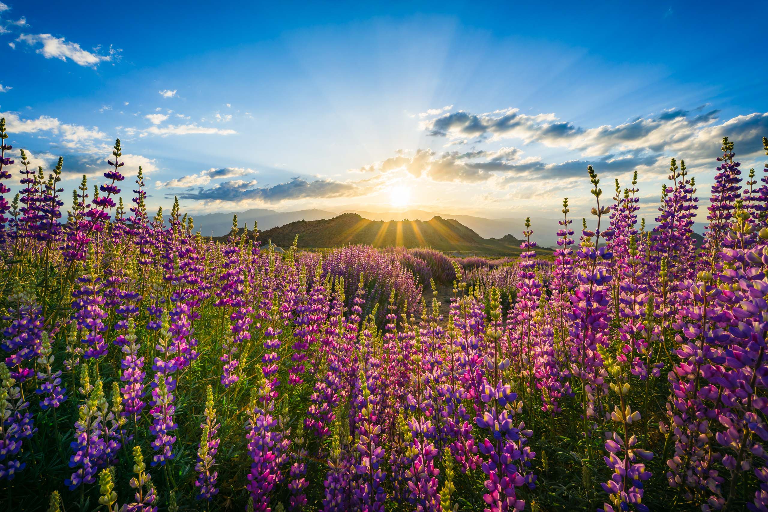
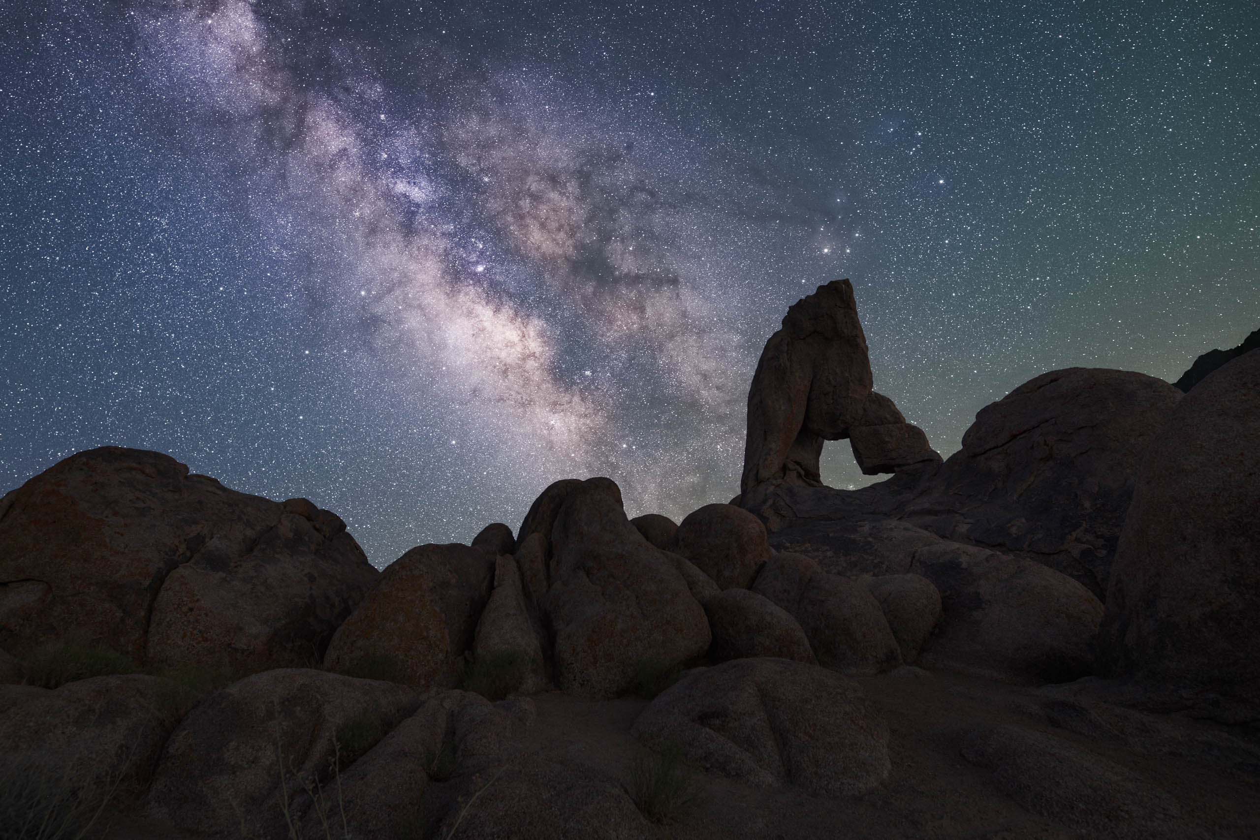
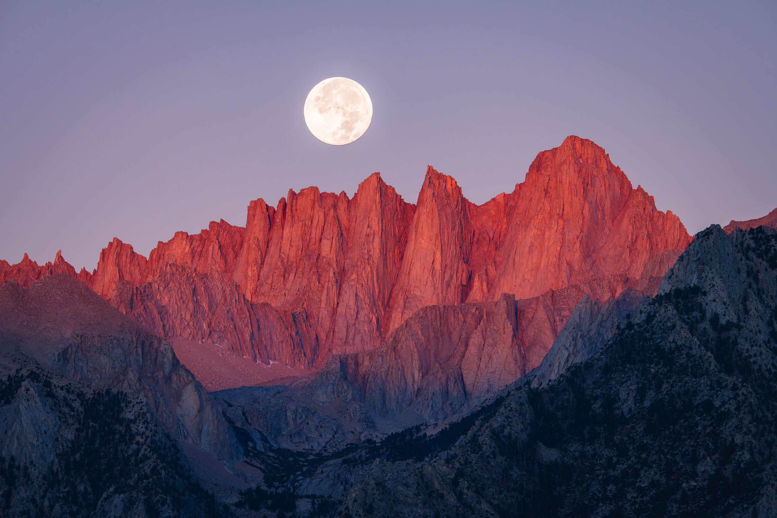
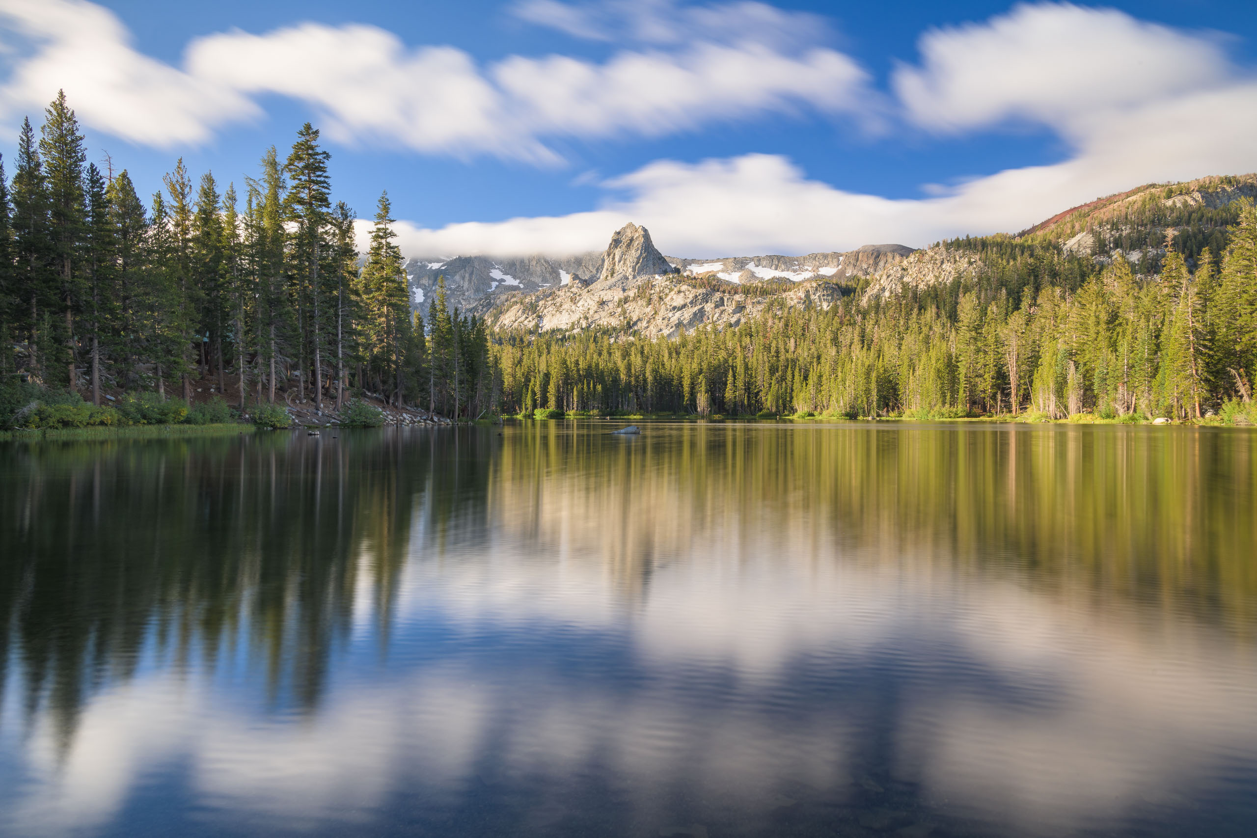
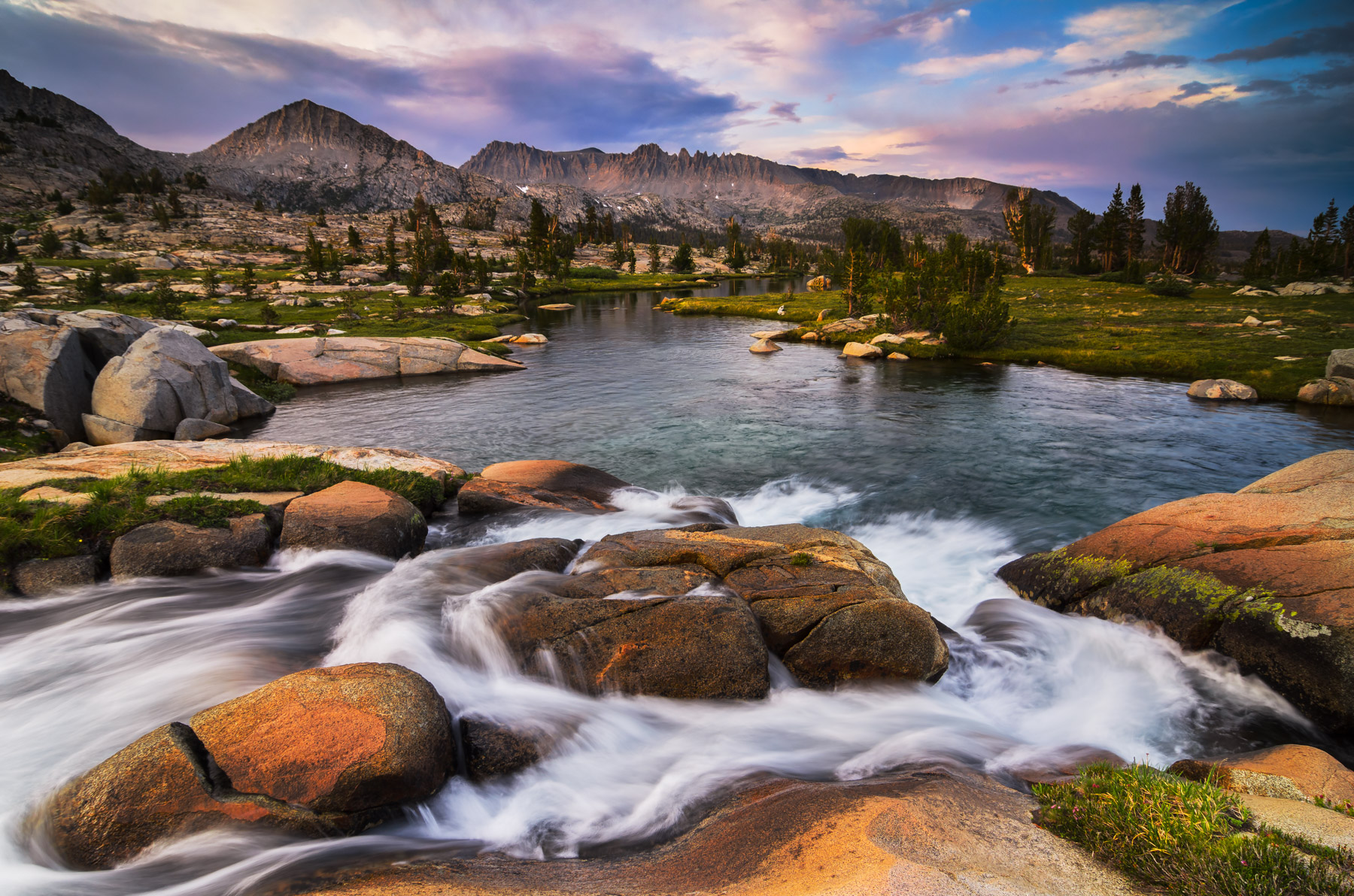
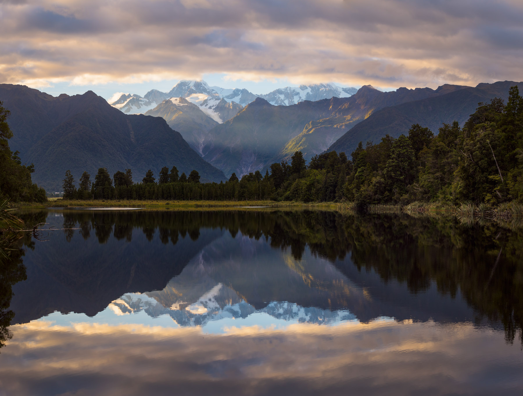
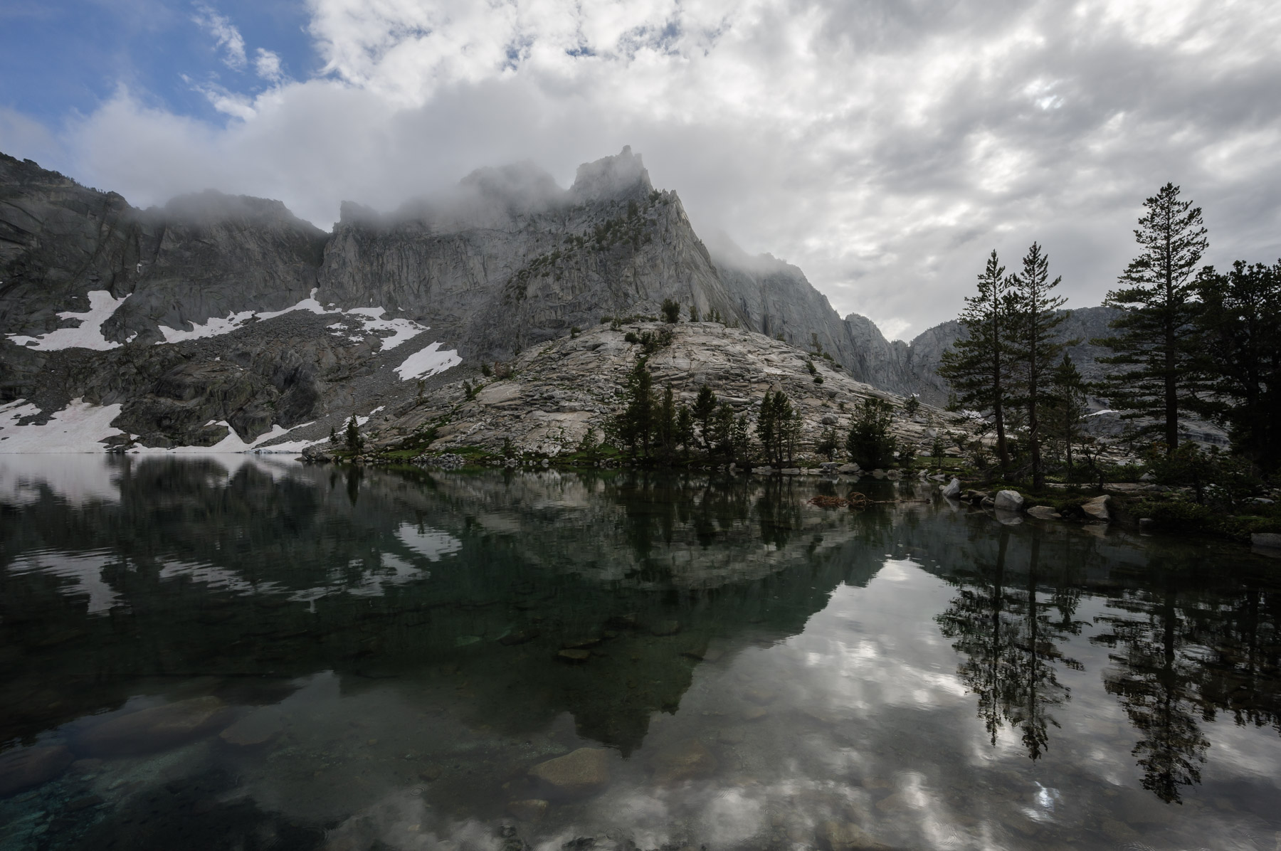
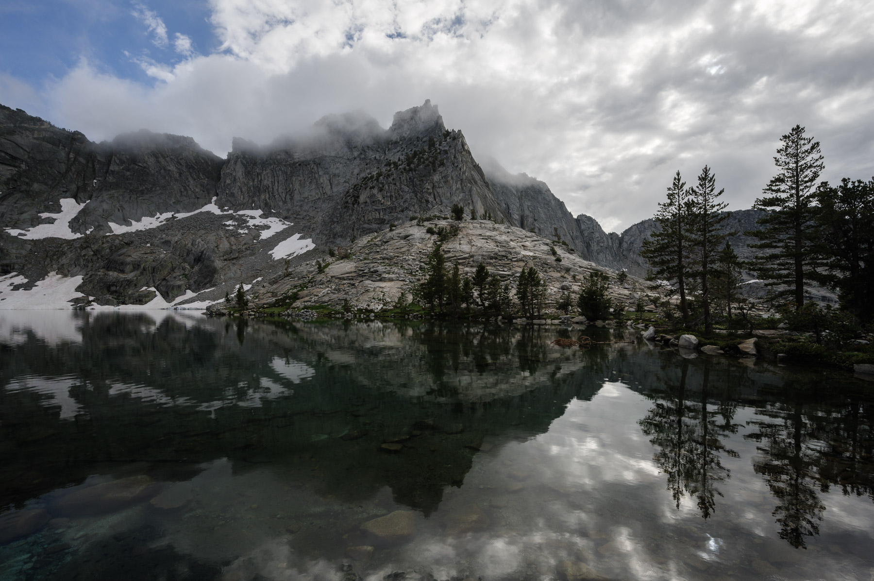
Let’s move onto the last topic in this series on contrast: Textural Contrast. This is simply when different parts of your photos have different textures which help them stand out from one another. Think a gritty rock surrounded by sinuous rushing water, or distant mountains not being as sharp and clear as nearby trees, as you can see in these examples:
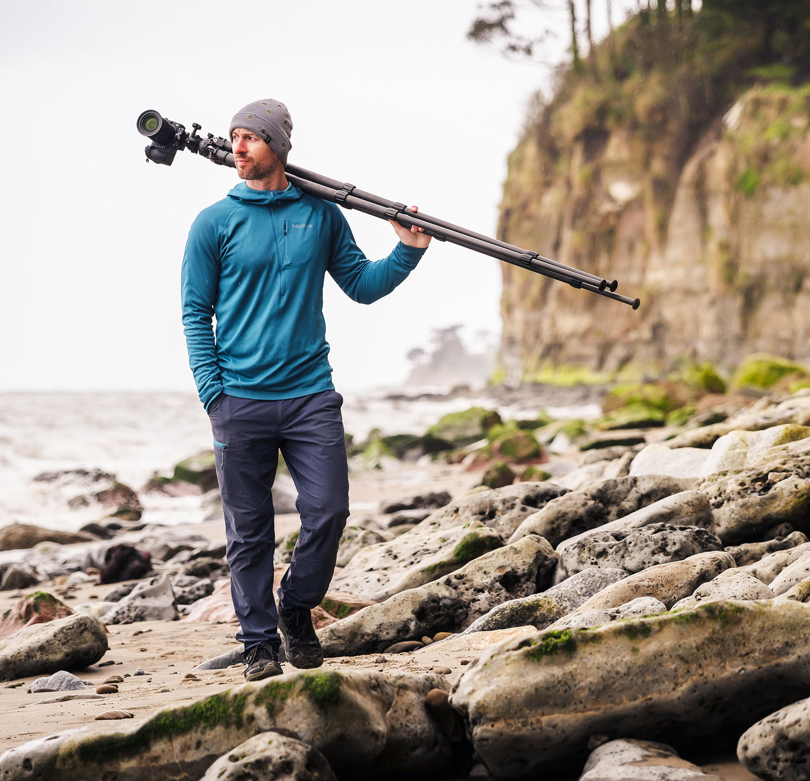
Textural contrast is the most underrated and overlooked type of visual contrast, and yet it can have a profound impact on your photos. In my mind there are essentially two main ways of using textural contrast in photography:
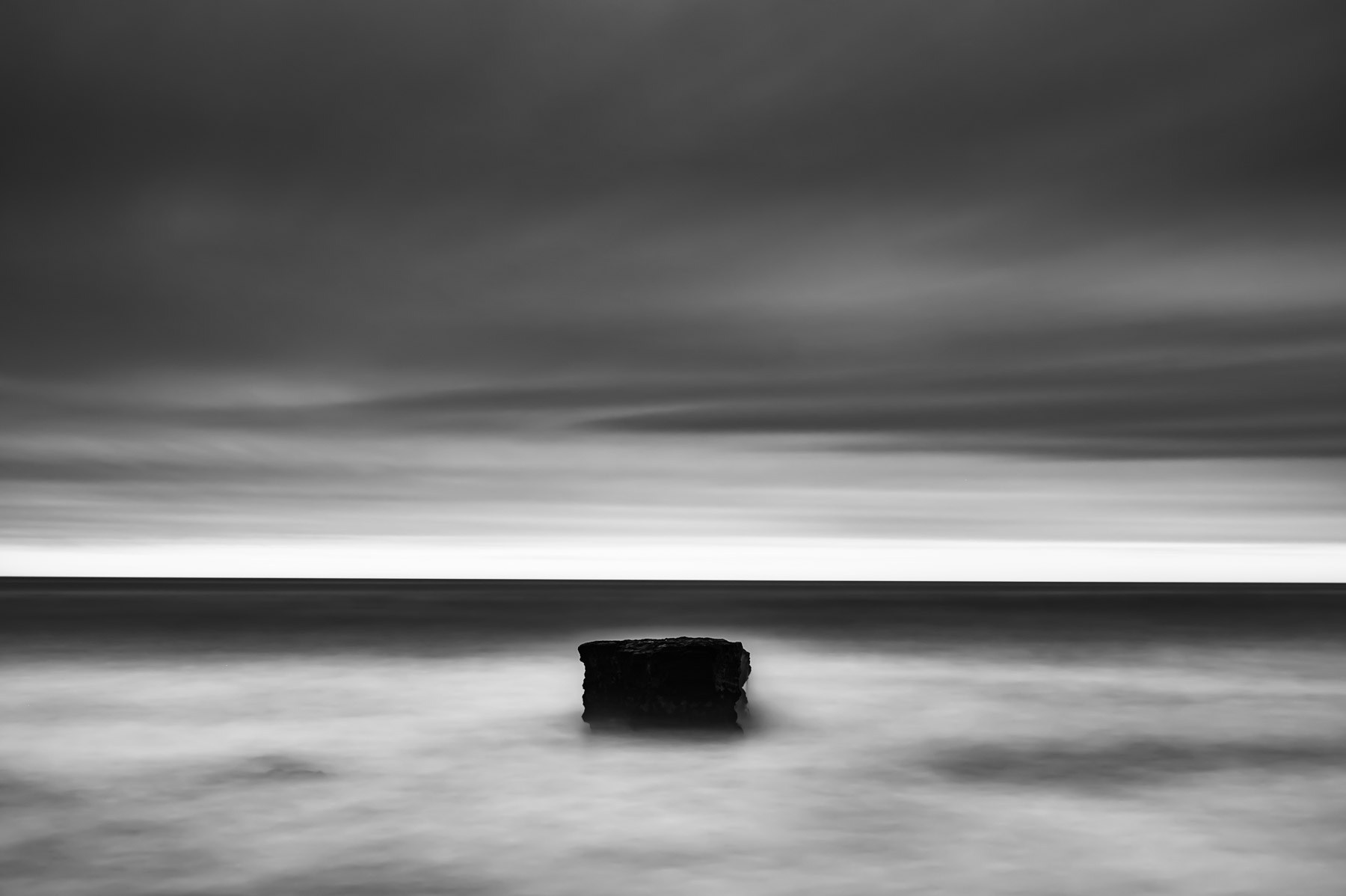
Just like with color and tonal contrast, you can use textural contrast to help your subject stand out from its surroundings. You already saw an example of this with the rushing cascade photo above. And as that photo hints at, one of the coolest things about textural contrast is that it can often be created through clever camera technique. A wonderful way to do this is by using long exposures.
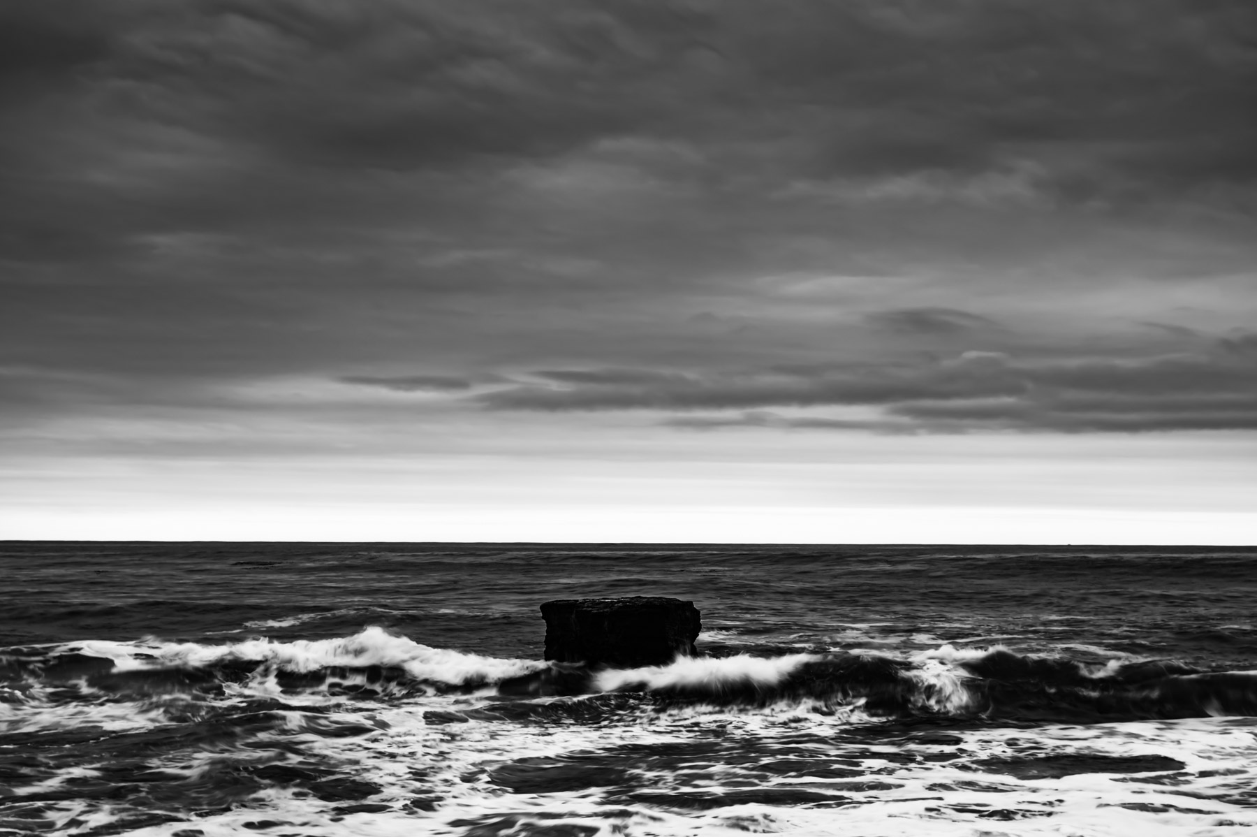
Below is a scene from the coast of California. Notice how in the photo on the left there is lots of detail in the rock AND the water? As a consequence, neither element really pops. But by putting a 10-stop filter on my lens and shooting a 3-minute long exposure, I made the water completely smooth. This texture change makes both the water and the rocks stand out much more clearly.
Last week we talked about how using tonal contrasts–like lightening distant subjects–can help them appear farther away, improving depth and separation within the photo. The same is true of textural contrasts: if your foreground is razor sharp, you can let your background details soften a little bit to create a sense of increased distance. I don’t mean that these objects should necessarily be out of focus, but instead that you don’t have to see every nook and cranny of a mountain that’s 10 miles away from you. One of my favorite ways to introduce this kind of textural contrast is in post processing: take an adjustment brush with -20 Texture, Clarity, and Dehaze and paint over distant objects. They will appear to become even farther away, without actually sacrificing focus and sharpness. This works especially well when there’s already a little atmosphere in the scene.
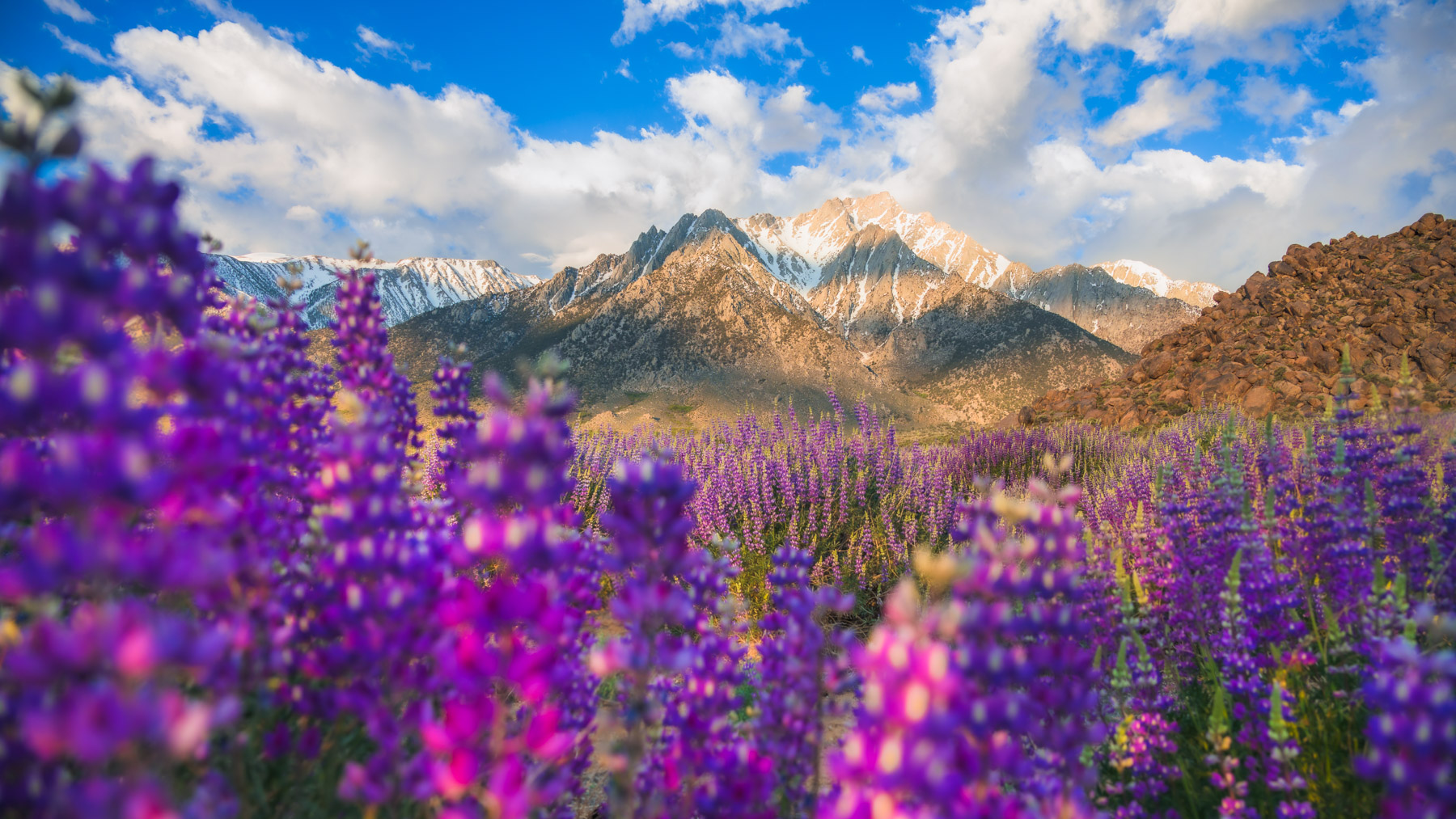
Although it’s much less common in landscape photography, the opposite approach can also be used for a high level of impact: if you want to call extra attention to a distant subject, you can juxtapose it against a deliberately out-of-focus foreground by shooting at a low f-number. This is exactly how wildlife and portrait photographers make their subjects pop, so why not use it to make a landscape subject pop as well??
Textural contrast is less obvious than either color or tonal contrasts, but that doesn’t mean it’s any less important. When you practice finding, creating, and enhancing textural contrasts in your photos, you will gain the ability to elevate your subjects and create depth in elegant and subtle ways.
Stay tuned and thanks for reading,
Joshua