Skip to content
Did you know that there are three types of visual contrasts? They are Color Contrasts, Tonal Contrasts, and Textural Contrasts. If you learn to identify and utilize each type of contrast, your photos will really come to life. In this newsletter I’ll be talking about Color Contrast, which is one of the easiest to understand and implement.
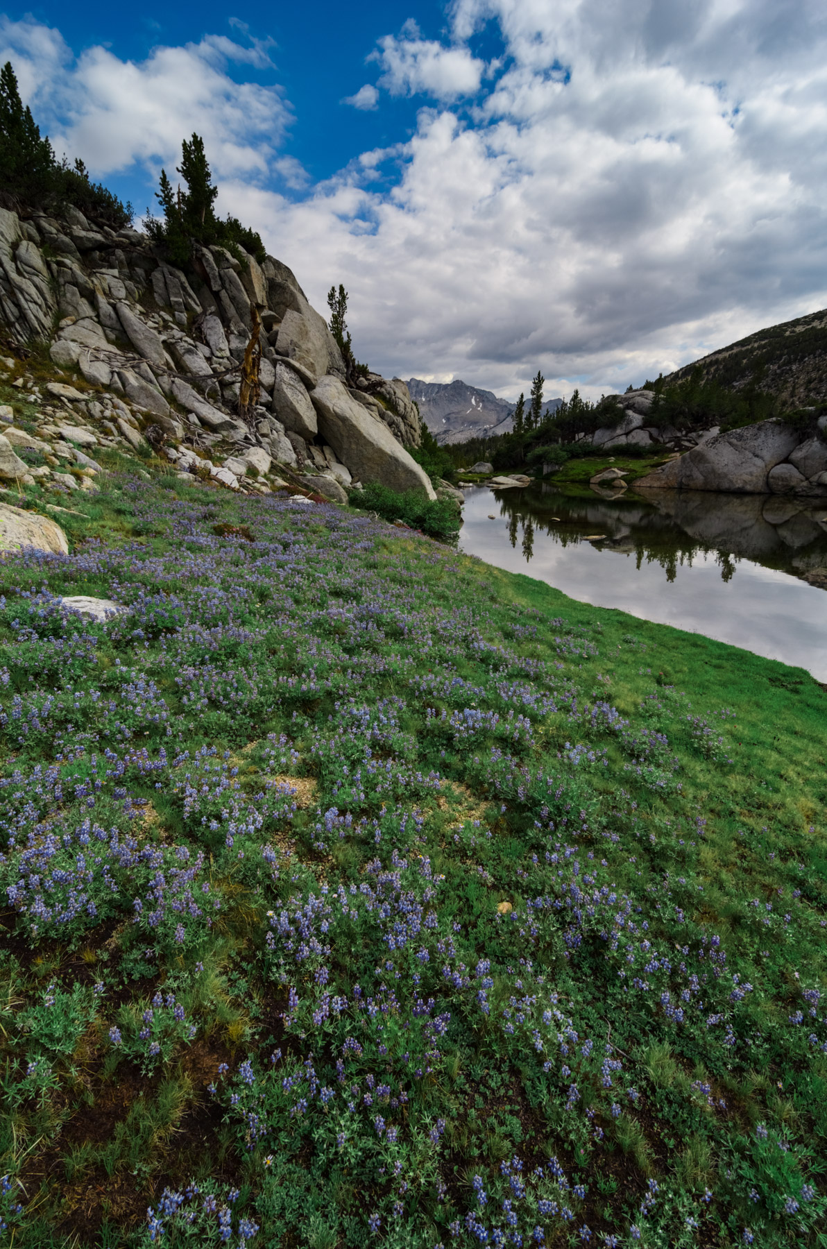
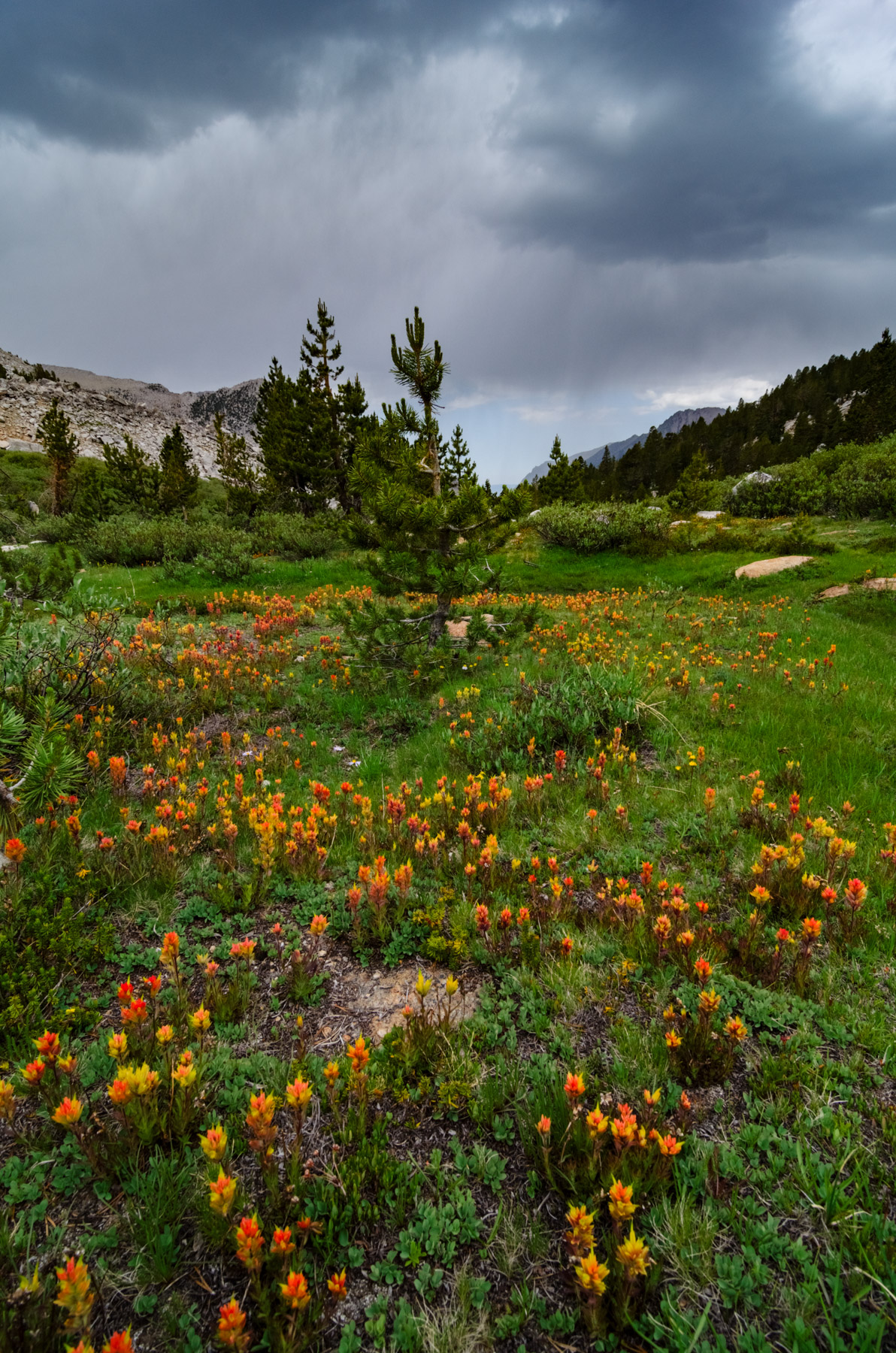
As you might imagine, Color Contrast is simply when two separate colors within an image contrast with each other, which helps each individual color stand out. The farther apart the colors are on the color wheel, the more they will contrast. Think Red vs Green, Blue vs Orange, or Yellow vs Purple. Check out the two photos below. Each of them is a wide-angle image of wildflowers in a field of green grass. But notice how the colors in the photo on the right pop more and are more distinct compared to the photo on the left. It’s because the flowers in the photo on the right have more color contrast to their surroundings.
Even if you have a good understanding of what Color Contrast is, you may still be wondering how best to use it in your photos. There are virtually endless ways, but here 3 of my favorites:
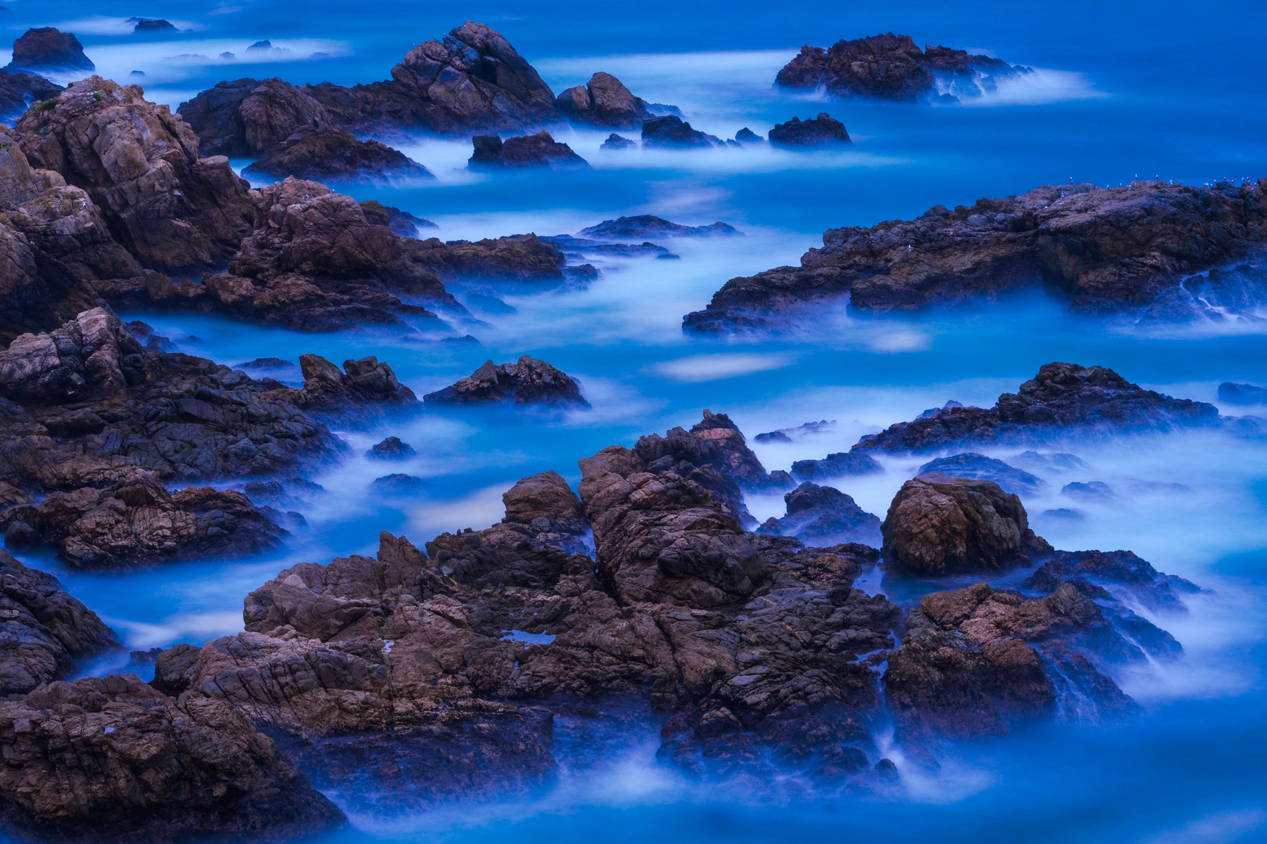
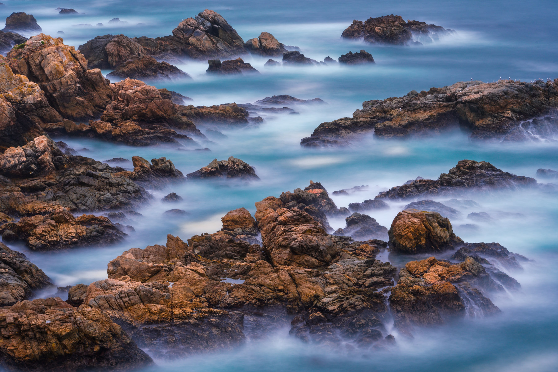
For example, in the images below, a cool white balance (first photo) makes the water overly blue and mutes the natural orange colors of the rocks. But choosing a warmer white balance (second photo) helps the colors of both the water and rocks become more distinct and gives each subject equal weight.
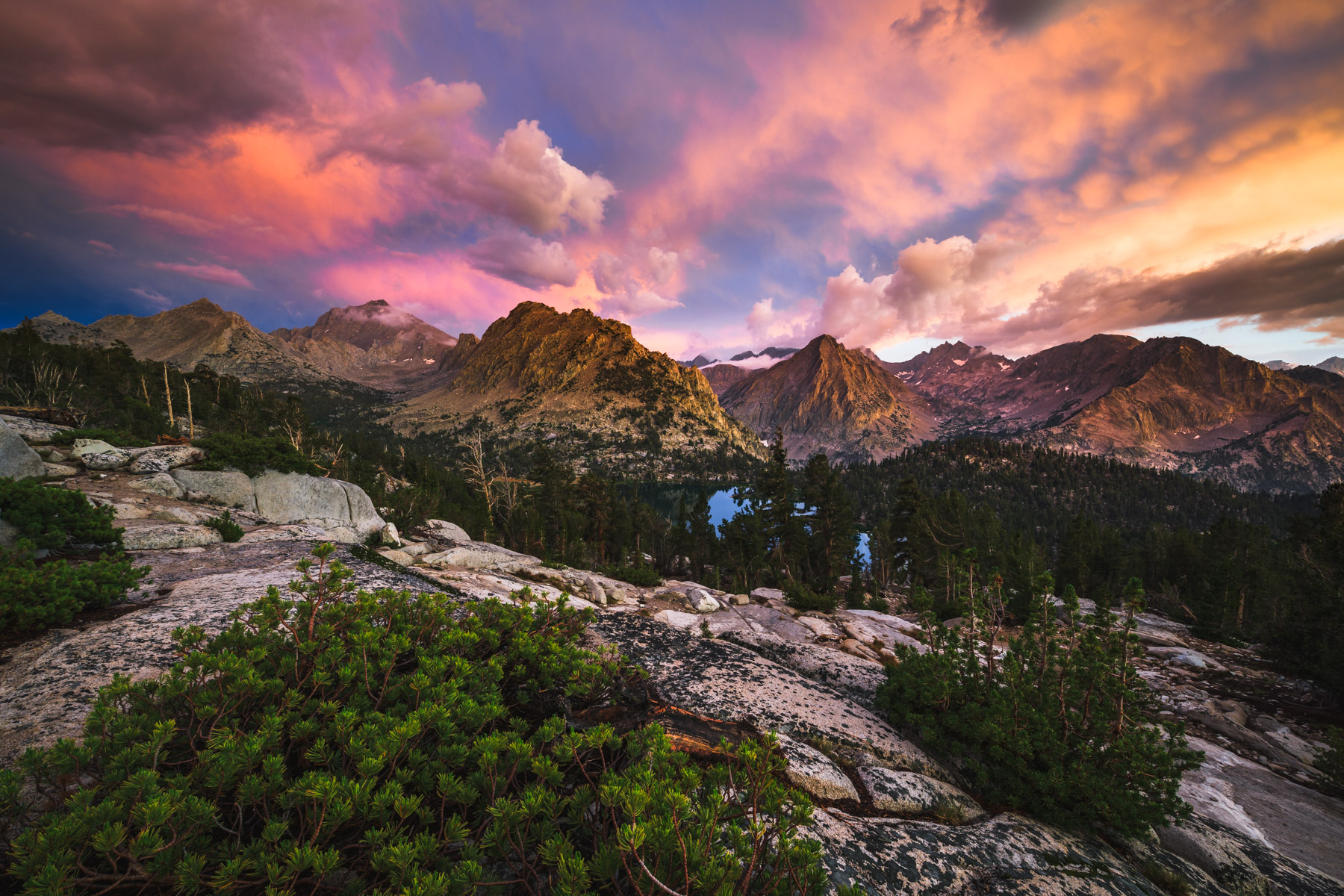
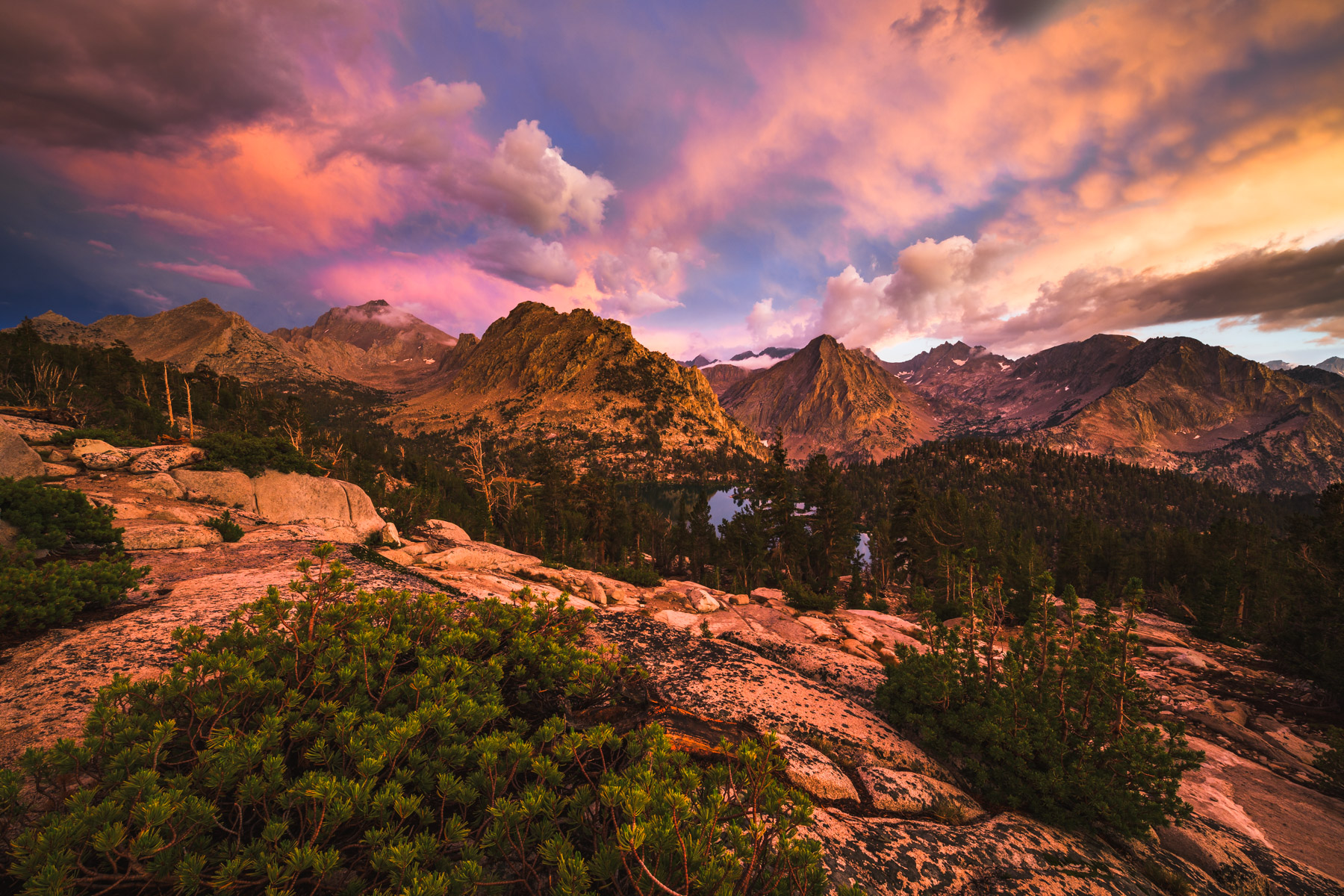
In the photo below, the sky was so brilliant and colorful that it cast an intense orange glow over the landscape (first photo). Through post processing, I removed that color cast on the foreground. This created color separation and a more pleasing color scheme overall, which helps each individual element in the photo stand out (second photo).
Once you start to look for color contrasts you’ll see them everywhere and you can begin utilizing them when creating your shots. If you need a bit more inspiration, check out Bryan Peterson, who talks a lot about color contrasts in his work. And remember that colors contrasts aren’t always created or found in the field. You can also use post processing to create or enhance existing color contrasts within your photos.
In the next articles I’ll dive more into the other two types of visual contrasts: tonal and textural contrasts. Then, beyond that we’ll delve into conceptual contrasts, where you use your camera to examine and compare concepts like life and death, or individuality and groups.
Stay tuned,
Joshua