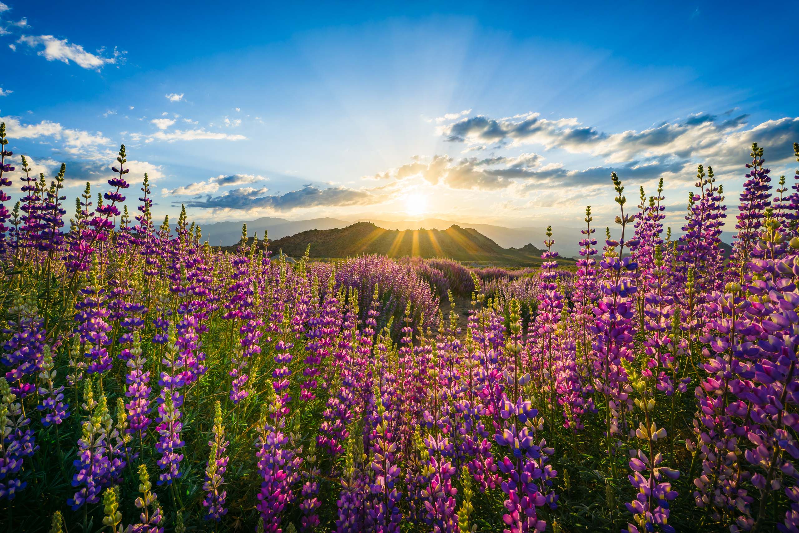
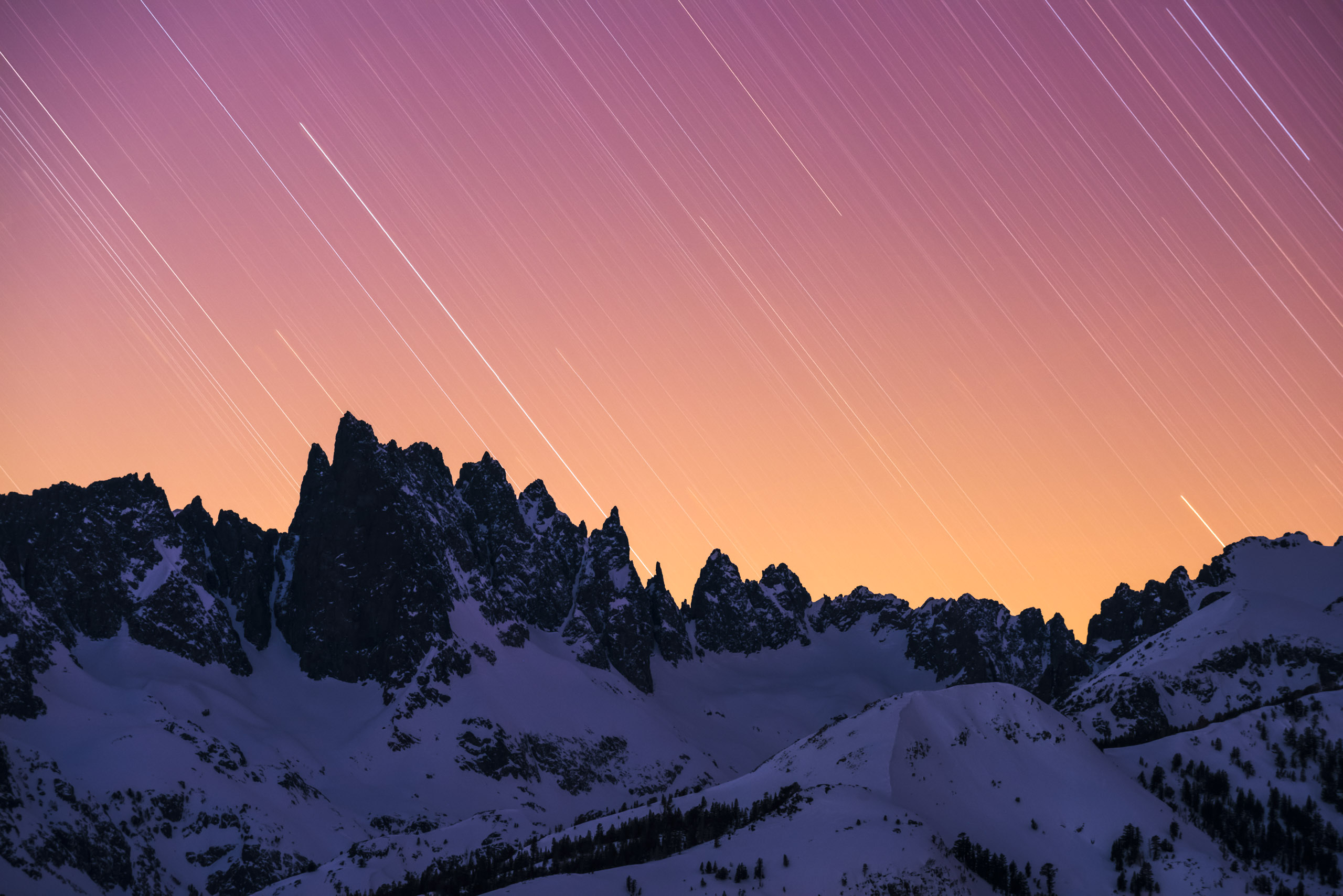
I’ve recently been writing about the world of visual contrasts, of which there are three types: Color, Tonal, and Textural. Today I want to talk about Conceptual Contrasts, which is a powerful idea that allows you to make the best use of those 3 types of visual contrast.
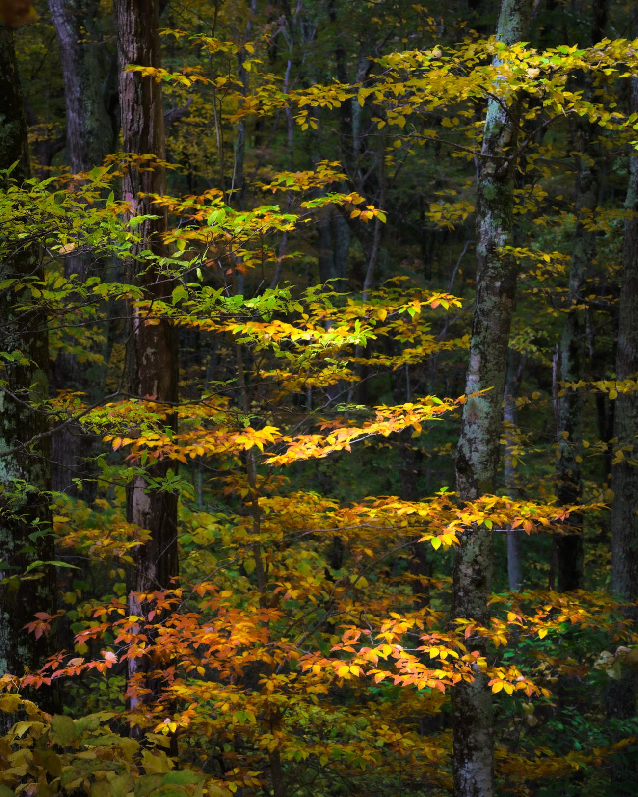
Let me start by giving you a few examples of conceptual contrasts: life vs death, fall vs winter, motion vs stillness, small vs big, rigid vs flexible, dry vs wet. As you can imagine, there is almost no limit to the many different kinds of these contrasts. More often than not, it’s extremely easy for our eyes and brains to notice these conceptual contrasts because they’re closely tied to the things we’re looking at. We’ll see a beautiful, lush forest with just one bare tree sticking out, and we can instantly notice this as a life vs death concept. Or we’ll see the changing leaves of Autumn and instantly internalize the passage of time and the collision of seasons.
But to be an effective photographer, you have to learn to translate the Conceptual Contrasts of your scenes into Visual Contrasts that you can actually shoot. Let me show you how.
Start by letting your eye and brain do what they do naturally: seeing THINGS and recognizing CONCEPTS. Then, take a few moments to think about the visual qualities of the things you’re photographing. Are they bright, dark, colorful, flat, textured, smooth, etc.? Once you understand those qualities, you can look for ways to make those qualities contrast with something else in the scene. In other words, once you understand the idea of your photo, use your composition and settings to emphasize its visual contrasts as much as possible to represent it in a photo.
Let me give you a few examples.
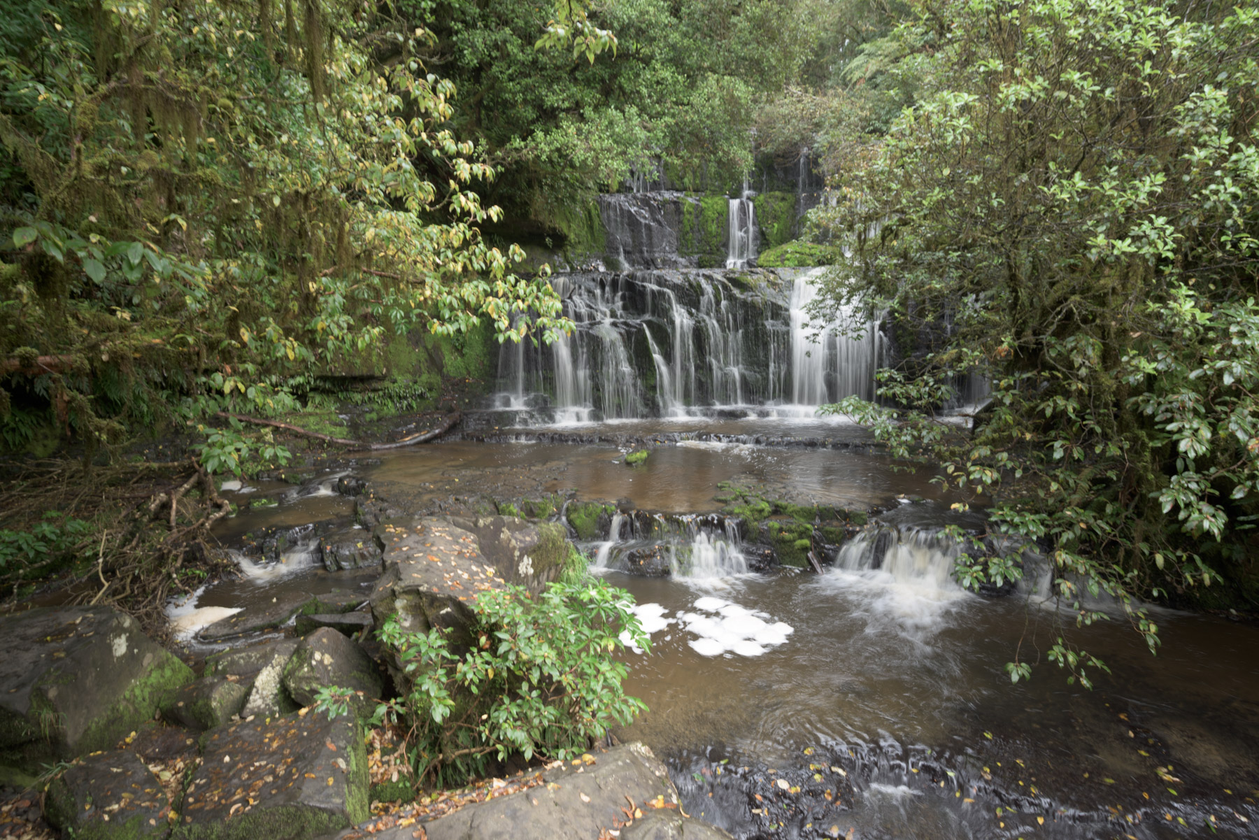
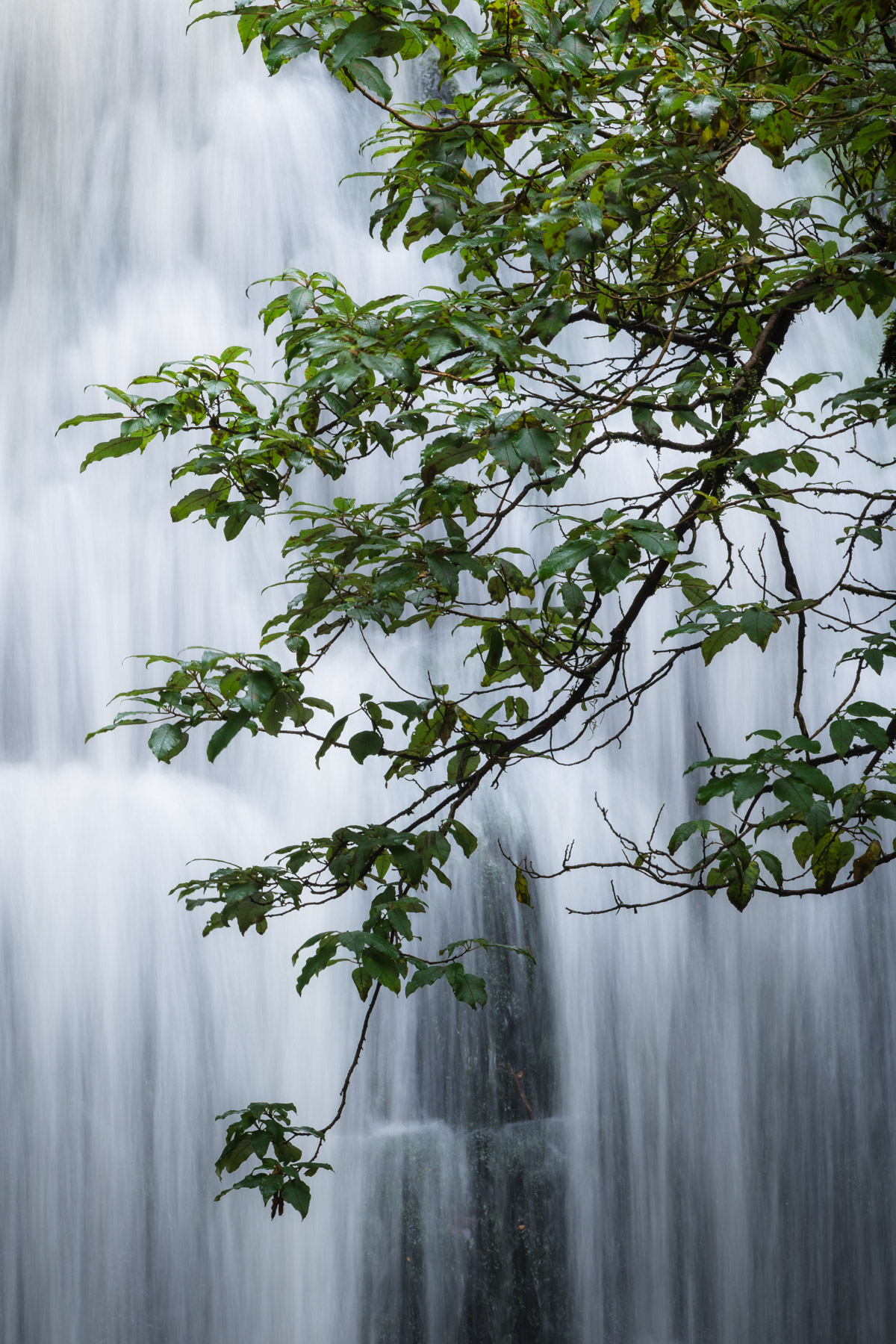
In this scene, I was photographing a waterfall in New Zealand. I loved how the rushing water of the cascade contrasted with the stillness of the branches. That was the main idea of the photo. So I started thinking about how those two subjects contrasted visually with each other and noticed strong textural and tonal contrasts. But in my wider frame (left photo), the texture and tone of the branches blended in too much with the other foliage in the scene. I put on a long lens so that I could isolate just the part of the cascade that best showed the texture and tone contrasts between the water and branches (right photo). As a consequence, the idea of the scene is represented clearly.
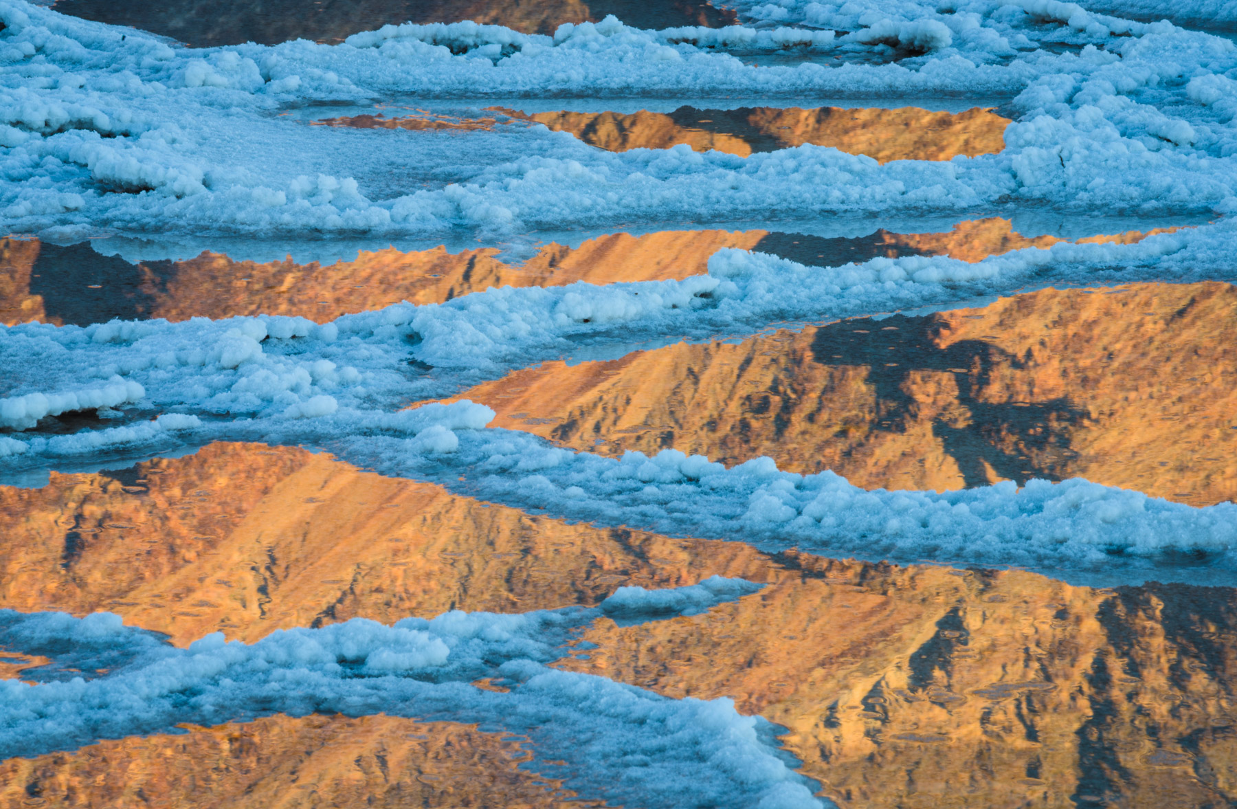
Here’s one from Death Valley. I was walking across a semi-flooded Badwater Basin near the end of a clear day. The late afternoon sunlight was striking the eastern mountains, turning them a rich orange, whereas the white salt of the basin was in shade. This created a marvelous contrast of temperature and a feeling of two different parts of the day colliding. Thankfully, it wasn’t difficult to realize that the way to sum up those ideas visually was to contrast the colors of the light. I framed up a composition where the warm mountains would reflect in between the cool blue salt patterns, and I deliberately excluded all other elements to take this shot.
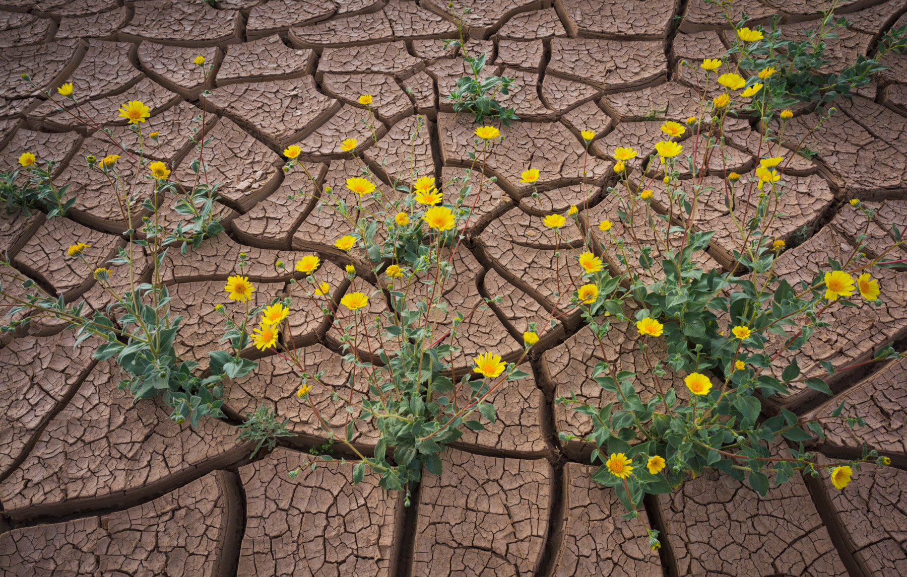
Another one from Death Valley. I got lucky in 2016 to find the park covered with yellow blooms. Though there were areas absolutely carpeted by flowers, I was more intrigued by this spot where the flowers grew sporadically out of these deep mud cracks. It instantly called to mind ideas like life vs lifelessness and youth vs age. I took time to think about how I could portray those concepts through the visual contrasts present in the scene. I discovered that if I stood above the flowers and shot down at them, I could directly contrast their vivid colors against the drab mud and their smooth textures against the rough cracks of the Earth. By thinking through the visual contrasts of the scene, I was better able to create a composition that presented the concepts that resonated with me.
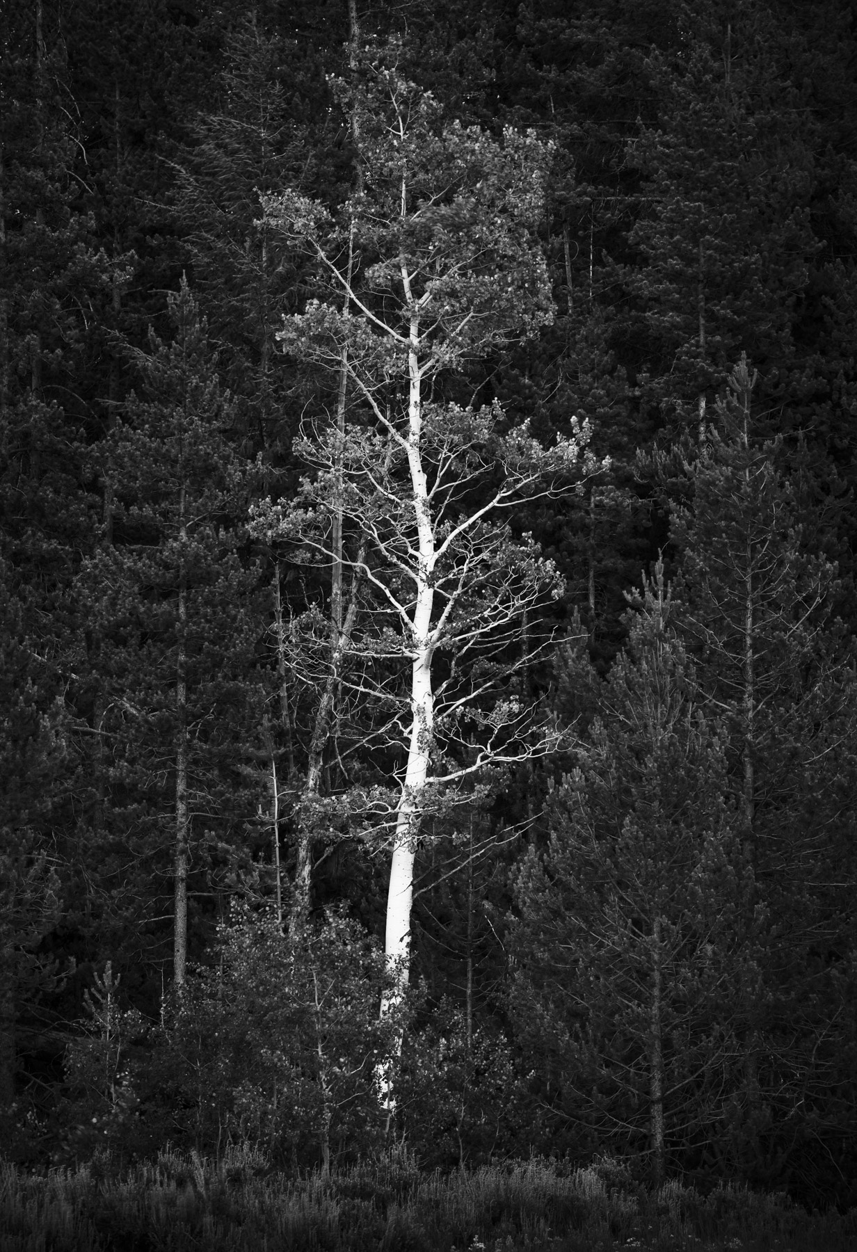
One last example before I sign off. My first (and only) time in Grand Teton National Park, I was strolling around near a meadow and spied this single aspen growing among a stand of pine trees. I loved the way its twisting shape and bright trunk set it apart from the other trees, as it made me think of ideas like being unique, one of a kind, and standing out from a crowd. But how to represent those ideas visually? You got it, I started thinking about what kind of visual contrasts were present and how I could use them. Was there color contrast? Nope. In this case, all the trees were the same shade of green. Texture? Only a little, just in the curving shape of the aspen trunk. Tonal? Yes, the trunk of the aspen was very bright compared to the pines, and its leaves were also slightly brighter than the pine needles.
So, I knew that to make the tree stand out and really highlight the concepts in my mind, I could emphasize the tonal contrast. I framed the shot to include the aspen tree and its surrounding crowd of pines. Then after taking the photo, I brought the raw file into Lightroom, converted it to black and white, and did some fine-tuned dodging and burning to help separate the aspen tree from the rest of the pines, creating a final image evocative of the ideas I had when viewing the scene.
To recap: Once something in the field strikes you, or a conceptual contrast jumps out at you, see if you can identify what kind of visual contrasts exist within the scene. Then, use your composition, camera settings, and post-processing to enhance those visual contrasts. Do this and you will see the ideas of your photos springing to life.
Over the past few newsletters, you’ve seen just how powerful contrast is in photography. But does every photograph have to utilize as much visual contrast as possible? Not necessarily. Oftentimes, homogeneity is just as compelling in a photo and can help us simplify complex scenes. I’ll be talking about that in the next newsletter.
Stay tuned, and thanks for reading,
Joshua

2 Responses
I love this article, Josh. It gives me ideas for distilling the essence of a scene. I will try it out next week in Yosemite.
Right on, Bill, glad you enjoyed it. Have fun in Yosemite.