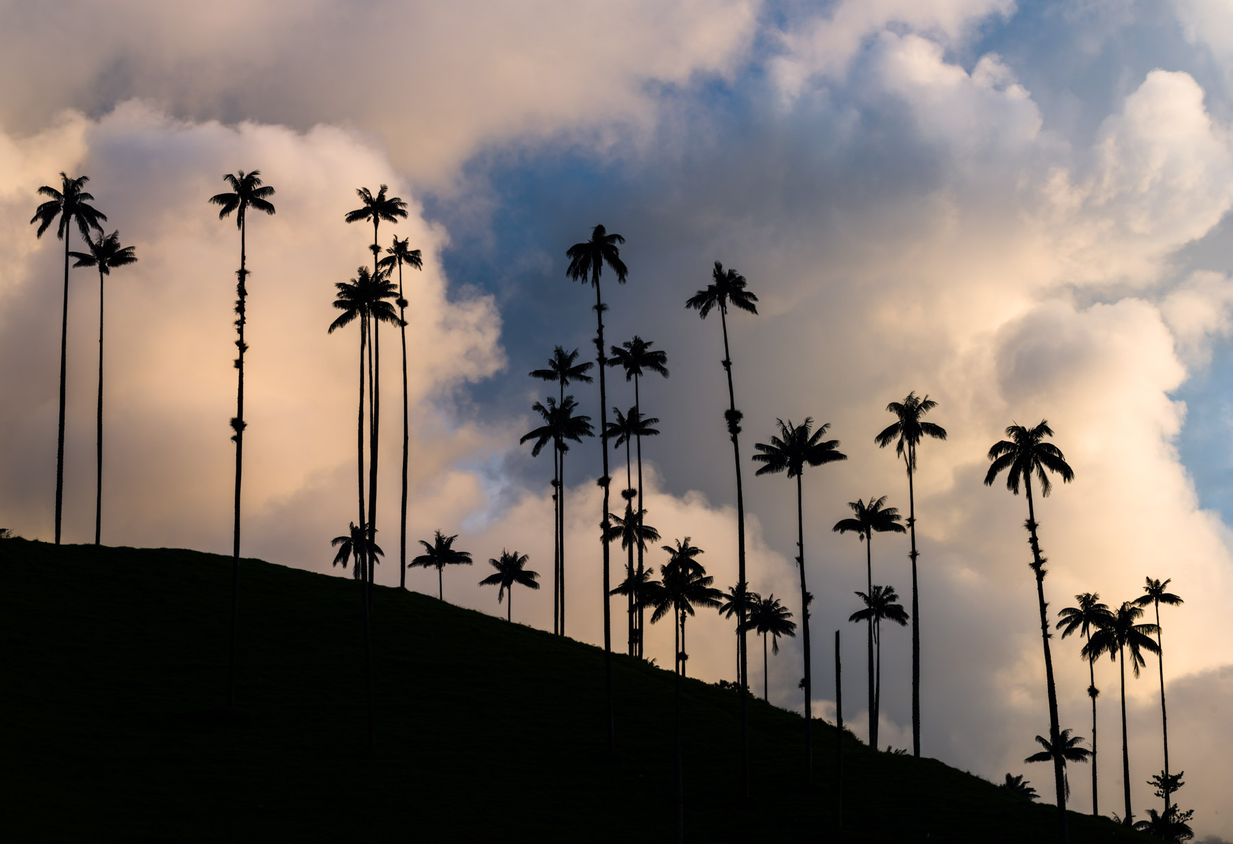
In this article we’re talking about Tonal Contrast. Tonal contrast is when you have dark elements contrasting with lighter elements in your images, as you can see with this shot of silhouetted palm trees.
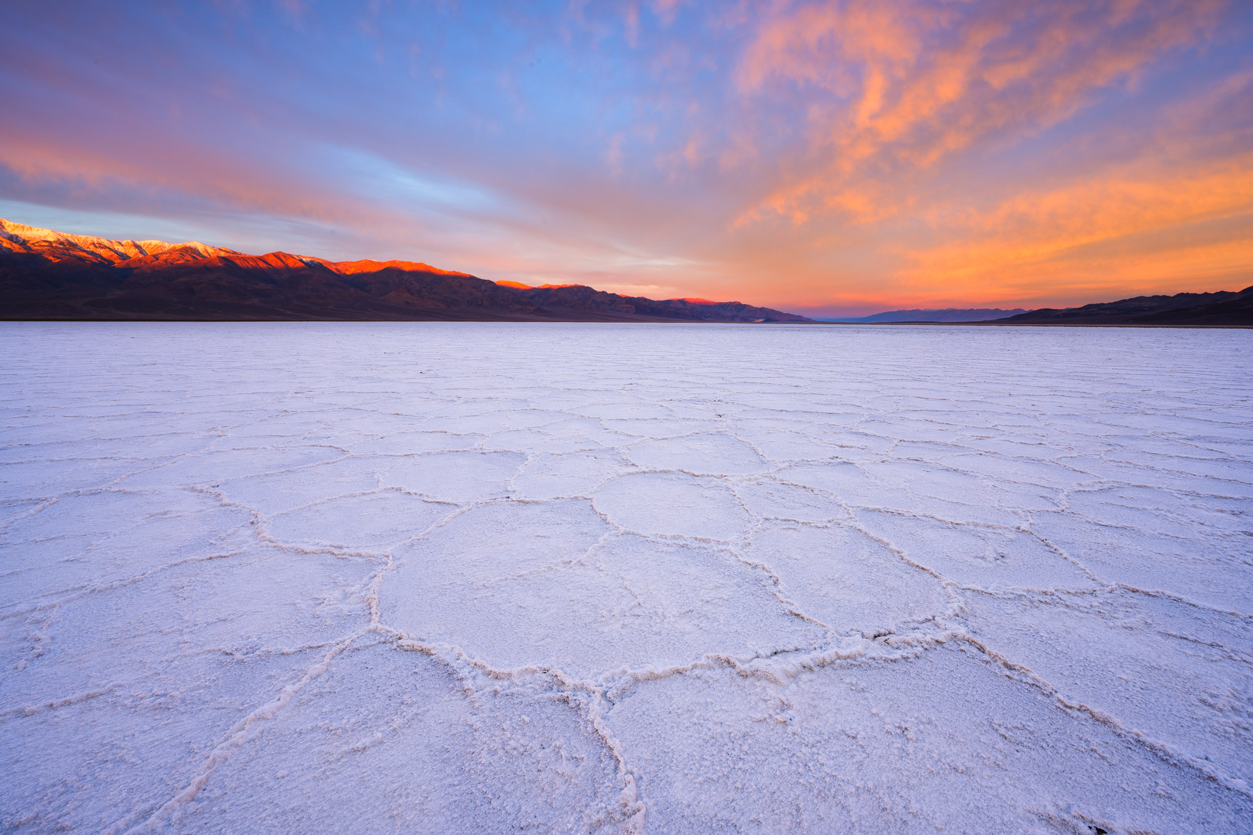
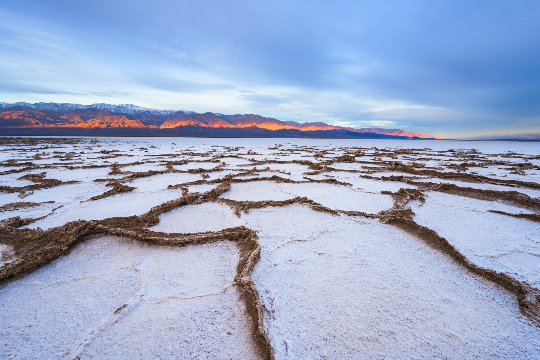
This type of visual contrast is incredibly powerful and brings a lot of impact to your images. For example, take a look at the two images below. These are two very similar scenes shot on the same morning, but notice how the foreground of the photo on the right draws you in more? That’s because the tonal contrast between the dark lines of mud and the white salt is so vivid and eye-catching. (You can click on all the photos in this newsletter to make them larger).
As with color contrast, there are many ways to use tonal contrast in your photos, so I’ll present 3 of my favorites:
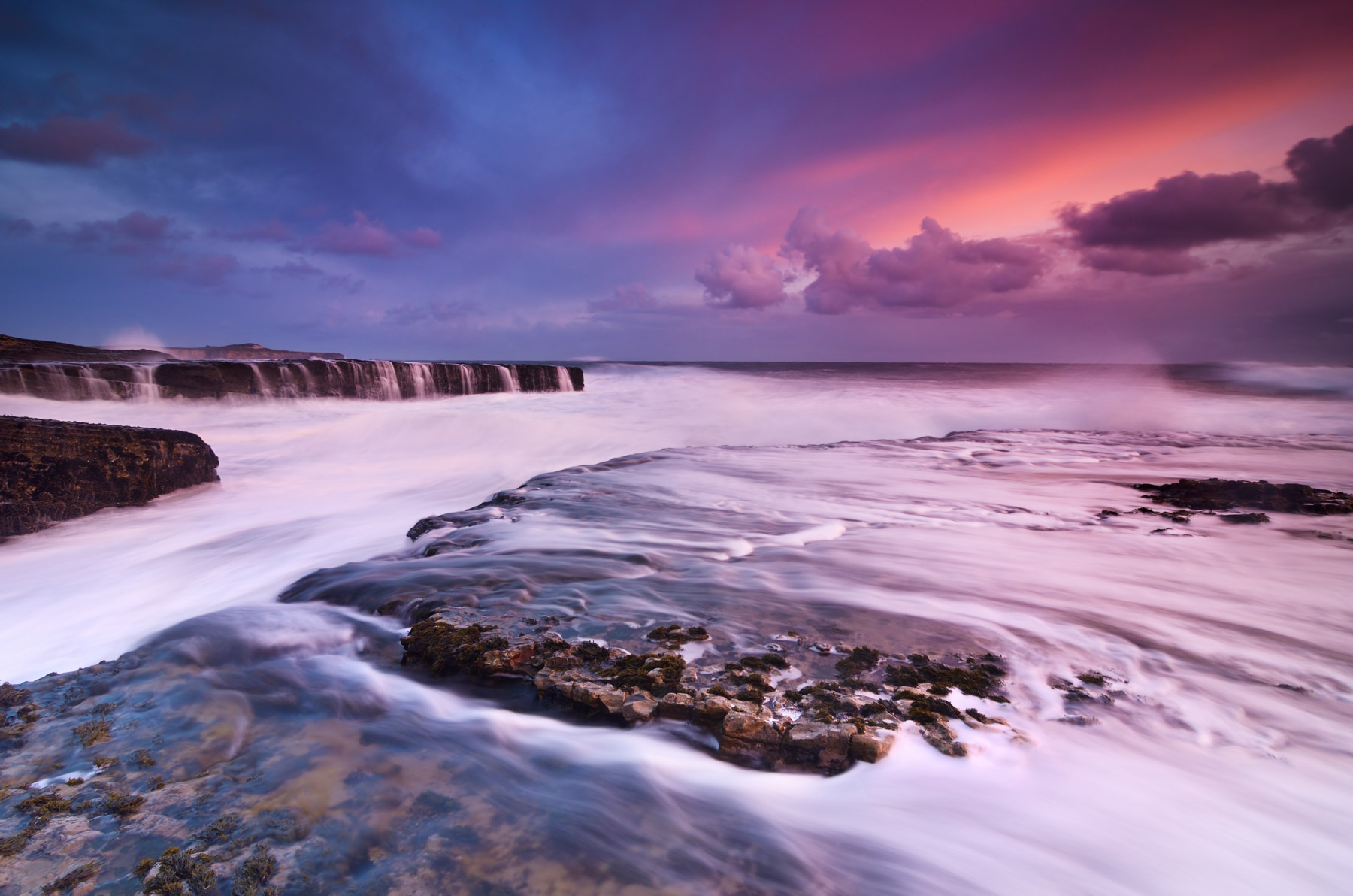
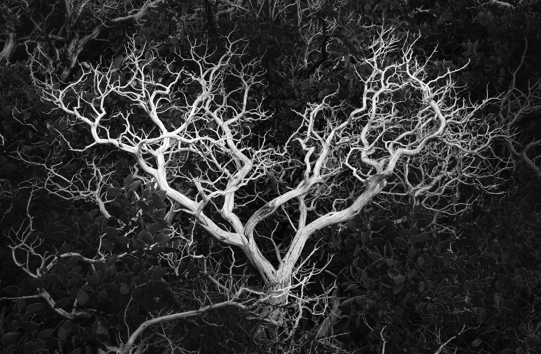
Perhaps the most obvious way to use tonal contrast is to help your subject POP. For example you could look for something like a dark rock to use as a contrasting foreground element against white ocean waves, as in the photo at left. You can also use post processing to enhance your subject and further isolate it from its background, as in the photo on the right where I used dodging and burning to help the heart shaped branches appear more distinct.
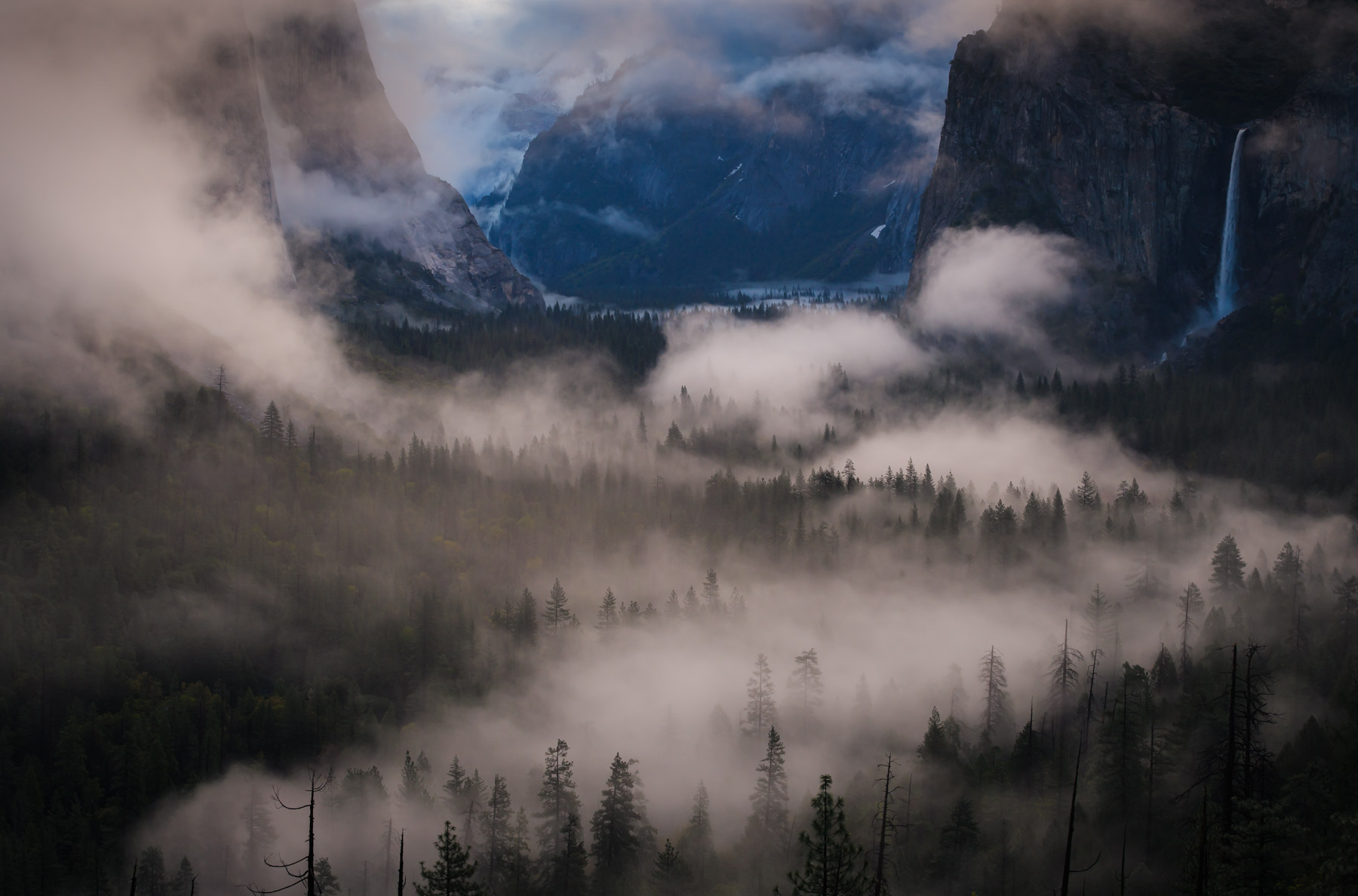
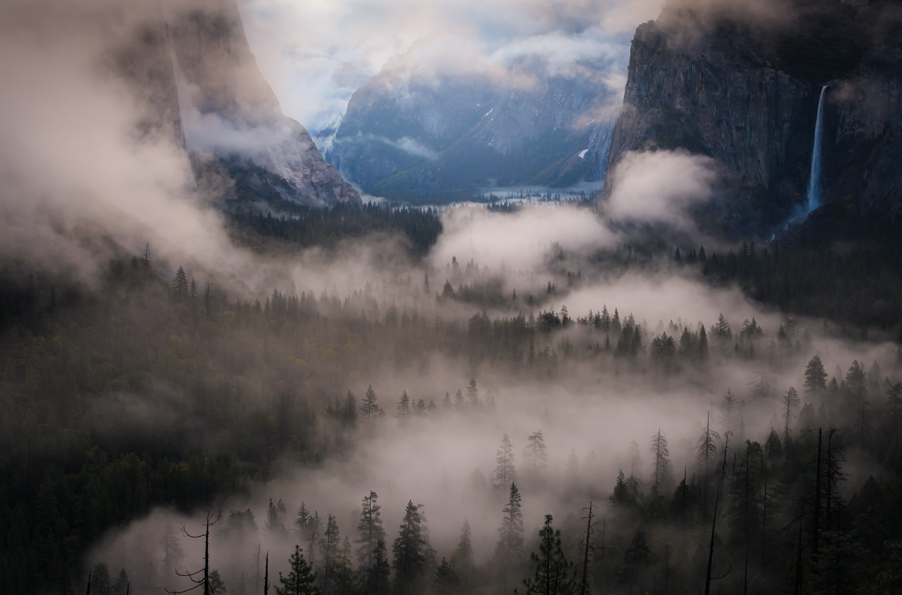
Our eyes are naturally drawn to the brightest areas of a photo. So if your scene is too even tonally, there may not be a clear focal point or visual pathway through the image. In the photo on the left, see how nothing is jumping out as an obvious focal point? But by brightening the background of the photo, I can create a visual flow from the bottom of the image to the top that gives the eye a destination to arrive at.
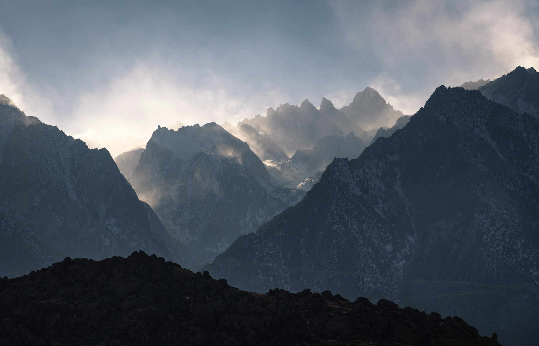
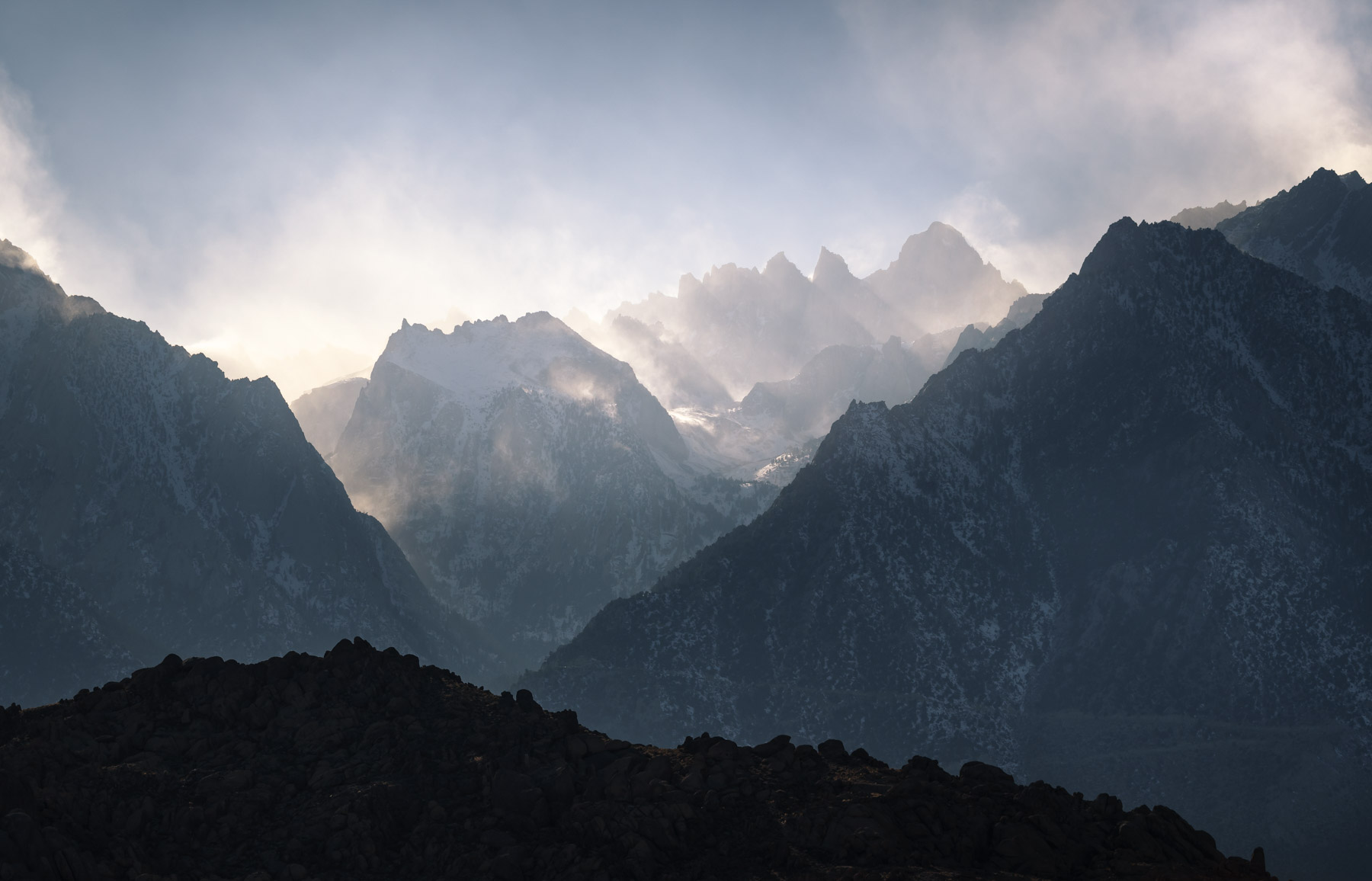
If you have a scene with lots of layers in it, you are likely to notice that it has some inherent tonal contrast as well: the layers closer to you are darker, and the layers farther away are lighter. But sometimes you might not get clean separation between layers that are close to each other. In the photo on the left, the mountain in the background doesn’t stand out that well from the surrounding ridges. But if I use a simple radial filter in Lightroom to brighten the mountain, it instantly creates separation from the lower ridges, and makes the mountain seem farther away as well, adding depth to the photo.
Tonal contrast may be the easiest kind of visual contrast to identify, it just takes paying attention and soon you’ll be seeing the everywhere. Almost every scene and photo will naturally contain some kind of tonal contrast. Think about how you can use the contrasts you see in the field to help your subjects pop, and to add depth to your compositions. Then use post processing to enhance separation and visual flow, and your photos will gain incredible impact.
Stay tuned and thanks for reading,
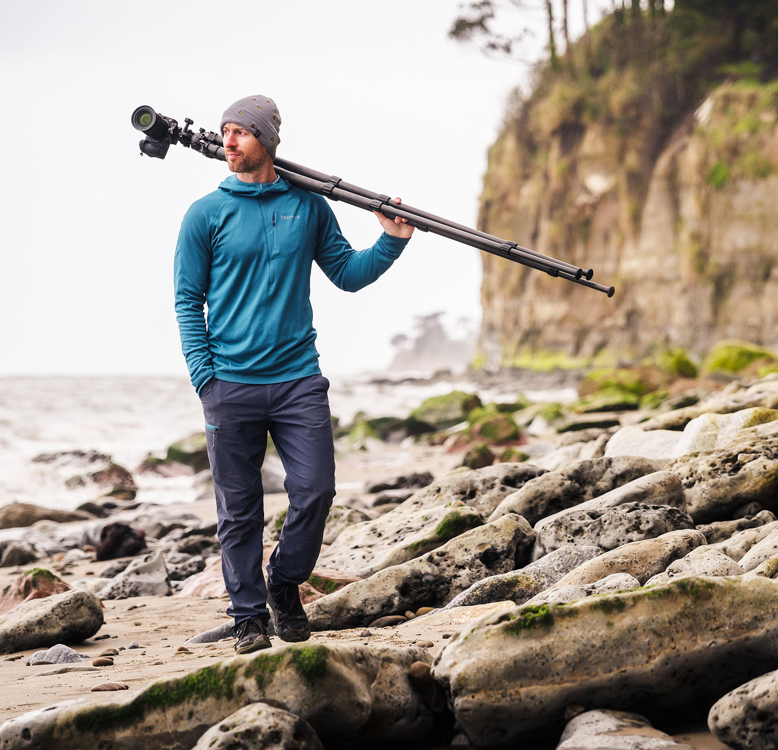
Joshua