Contrary to popular opinion, mistakes aren’t necessarily a bad thing. They help you learn, they keep Hallmark in business, and sometimes they go hand in hand with really excellent tattoos. And in landscape photography identifying some common mistakes can help you improve your photos by leaps and bounds. Mistakes are a controversial topic in the very subjective world of art. After all, one man’s mistake is another man’s mistook. Nevertheless, I’m going to plunge right in and tell you what I think are the top 5 most common mistakes made by landscape photographers.

Our eyes automatically home in on whatever is most interesting about a scene, so it’s only natural to take our cameras and point them straight at whatever we’re looking at, like say, this fantastic vista.
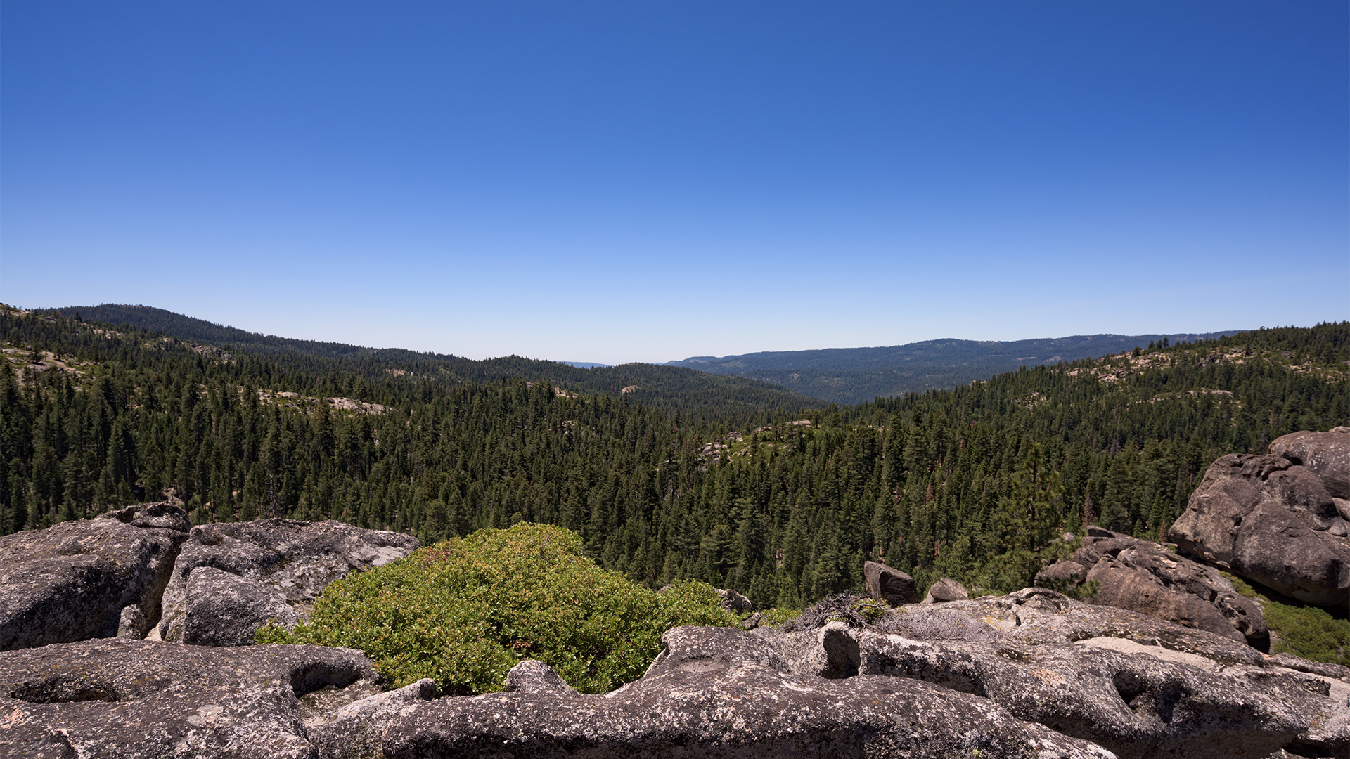
The only problem is, this tends to put our subject smack dab in the middle of the frame and fills half the photo with boring, blue, emptiness. To fix this, pan down, zoom in, or get closer in order to fill your photo with more goodness, and less emptiness.

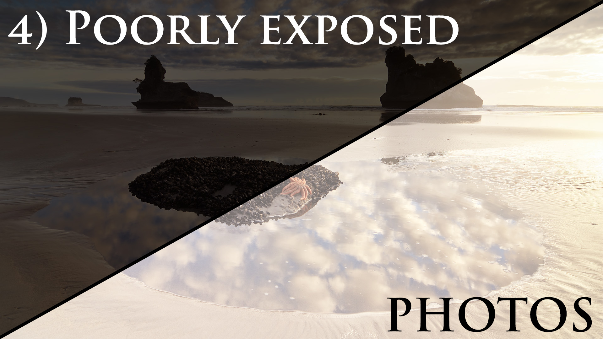
Your LCD will lie to you. Depending on the lighting conditions you’re shooting in, as well as the brightness of your camera’s display, looking at the LCD alone makes it difficult -if not impossible- to tell if your photo is actually well-exposed. So instead of relying on the LCD, learn to read the histogram in order to get better exposures.
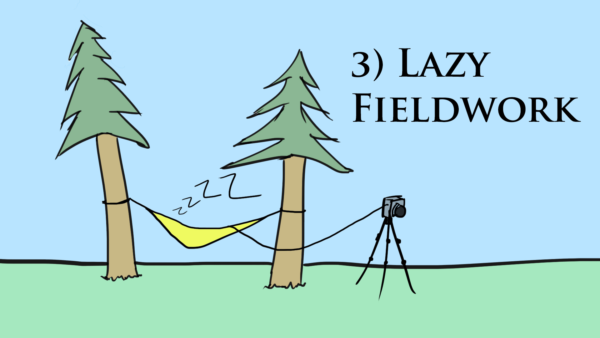
Part of the reason that the previous mistake happens so frequently is the idea that any mistakes made in the field can be fixed in post. This far-too-prevalent concept also leads to all kinds of lazy photography, from not using a tripod to making careless compositions. But this approach limits your photography in a serious way. Instead, if you take pains to capture the best possible photo in the field, then rather than making a bad photo good in post, you’ll be making a good photo great.
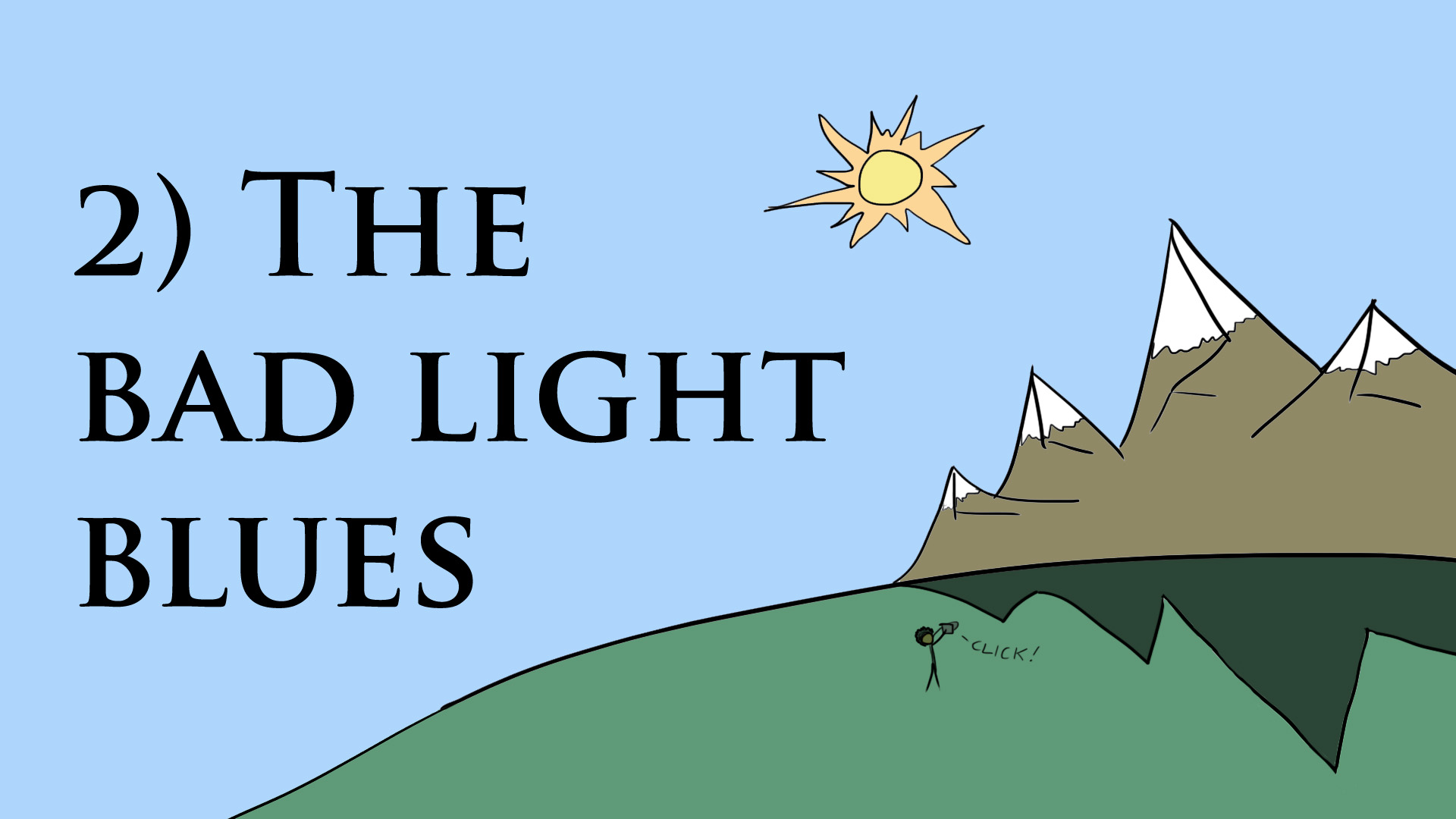
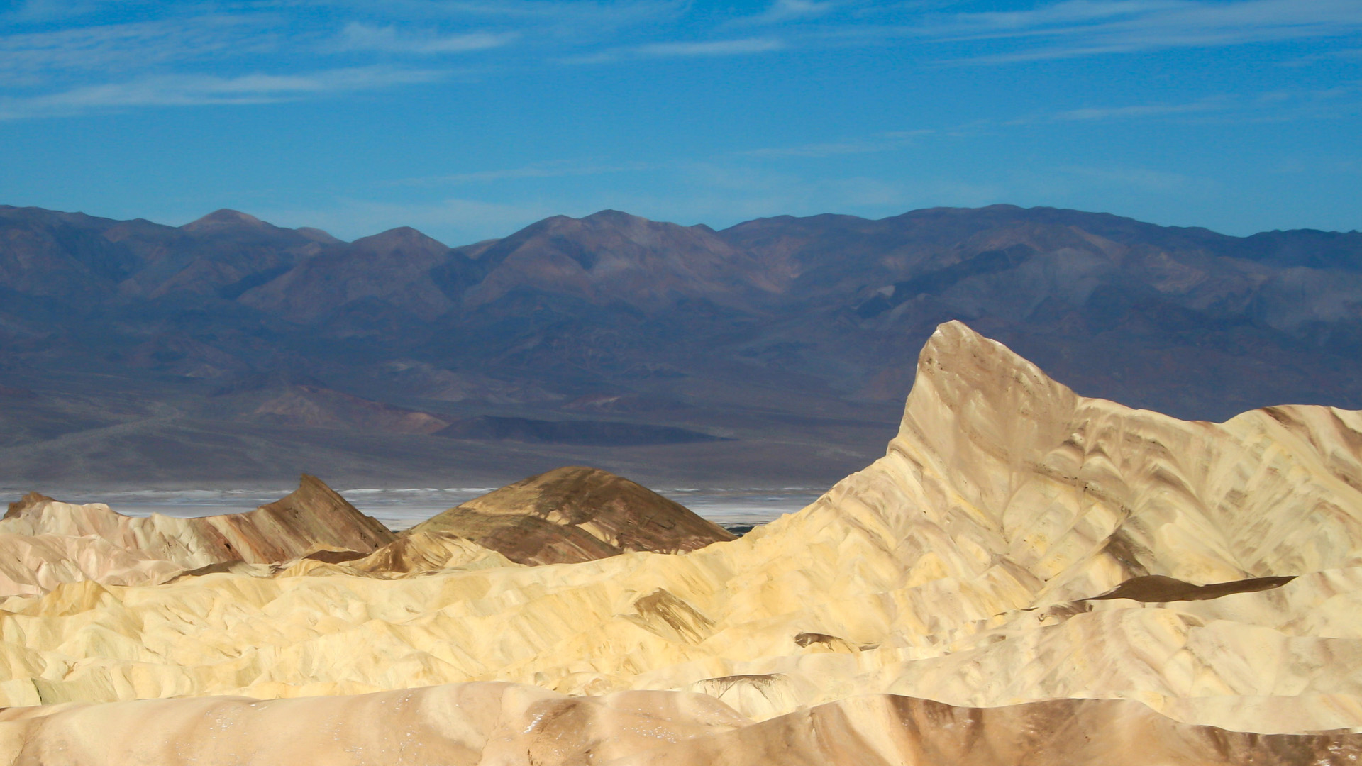
Ok ok, before I give mother nature low self esteem, I should say there’s really no such thing as bad light. There is however, light that doesn’t do anything to beautify the particular scene you’re photographing. And the common mistake I see is photographers trying to shoehorn this non-ideal light into a photo where it doesn’t belong.
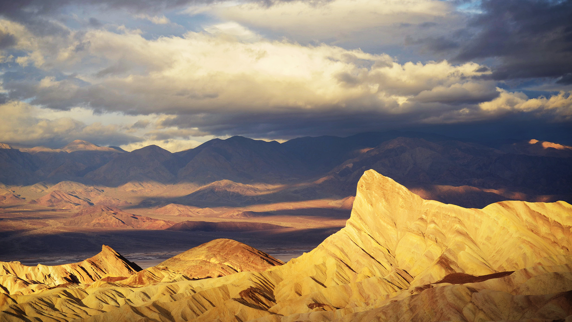
So for any scene you’re shooting, think about what kind of light will make it look the best. For landscape photography an easy place to start is shooting at sunrise or sunset, when the light is generally softer, more colorful, and more even.

And the number 1 mistake I see in landscape photography is this: not showing the viewer what your photo is about. Whether that’s because there’s too much stuff in your photo, there are distracting elements on the edges, or you’re simply not close enough to your subject, the problem is one of obfuscation, or of obscuring the message. And the way to fix it is simple: simplify.
Personally, I approach the issue like I’m making a caricature of the landscape: I figure out what the photo is really about, then I simplify and exaggerate those elements as much as possible, removing distractions and making it clear exactly what I want the viewer to see. Check out this article for more.
And there you have it, my top 5 mistakes in landscape photography. If you have your own common mistakes, feel free to leave them in the comments below.


14 Responses
I completely agree with #5 but perhaps you should have used a different example. The large expanse of rock was almost as boring as the large expanse of sky. Personally, I liked the second photo better but not a lot better. 🙂
I kinda like this. I do tend to use lots of sky but I also tend to shoot on cloudy days because I’m not a fan of heat or really bright contrast light for landscape. I am going to try that though and see what I come up with. Rule number one seems really useful too.
Thanks for telling us what you think are bad choices for photography…there are never rules for art…
Hi, I prefer the first photo to the second one , where you have cropped some of the sky You talk about simplificatión and contrast of certain type as a key element for a great picture . I think you have these ingredients in the first photo. The blue of the sky which only ocuppies slightly something more tan a 1/3 of the frame gives a feeling of peace and at the same time fits very well with the green of trees and the pink ot the rocks in the foreground.
You’re enphasizing too much the foreground( the rocks) in the second photo , so the rest of the elements in the landscape (forest, sky, etc) become second nature.
Cheers!
I understand why you feel there is too much “empty” sky in a lot of landscape photos, however I find nothing wrong with a lot of empty sky if your intent is to accentuate spaciousness. Just my 2 cents, thanks!
Hey Joe, you are right! It’s all about intent. That’s the key. That little bit of advice in the video is more aimed at giving people a starting place if they tend to put their horizons smack dab in the middle. Cheers,
Josh
#5 was pretty bad advice. For 1, photographers try to partition things in thirds, so having the top third sky, middle third forest, and bottom third rock is pretty great. The second shot doesn’t even add more forest, I think it actually has less, so you just traded some sky and some balance for more picture of rock. I guess that’s great if you like rocks but bad if you wanted a picture of the view.
Steve, I respectfully disagree. You may not like the aesthetics of the second shot but that doesn’t invalidate the advice of minimizing the sky. There are many different ways to approach the issue and you are free to shoot it however you like! Cheers,
Josh
Like all ‘rules’ in art, – learn them, practice them for average shots. Once you are confident with them – break them for outstanding images
Well said, thanks! The only thing I’d like to add is “break them with intent for outstanding images” 🙂
Totally agree, I liked more the “incorrect” first picture, second doesn’t seem visually appealing.
Agree as well. First shot lets me appreciate the expansiveness of the landscape. Second shot lets me appreciate rocks. I’m not really a fan of rocks either.
Sir …i am a bigner in photography…your topic was very interesting and thoughtful…looking ahead more of such knowledge… Thankyou
Great list. I usually have the light issue most often.